
Pie Charts
Pie charts are based on one metric and one attribute. They are supported by all Self-Service Analytics data connectors. This topic describes:Configure Settings for a Specific Pie Chart
Change the settings for a specific pie charts- Edit the pie chart you want to modify. See Edit Visuals.
- If you are editing the visual in a dashboard, select Settings from the visual drop-down menu. The sidebar menu for the visual appears. If you are editing the visual from the Visual Gallery, the sidebar appears to the right of the visual.
-
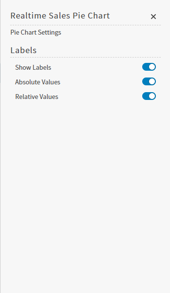
Select the settings icon on the sidebar menu. The Pie Chart Settings sidebar for the visual appears.
-
Alter the settings as needed:
- Optionally, edit the number or date and time format for this visual. See Number and Date Formatting for Visuals and Configure Date and Time Formatting.
- Select the save icon to save the dashboard and the visual with its updated settings.
Configure Colors for a Specific Pie Chart
Specify the color settings for a specific pie chart using the Color sidebar- Edit the visual you want to modify. See Edit Visuals.
-
If you are editing the visual in a dashboard, select Settings from the drop-down menu. The sidebar menu for the visual appears. If you are editing the visual from the Visual Gallery, the sidebar appears to the right of the visual.
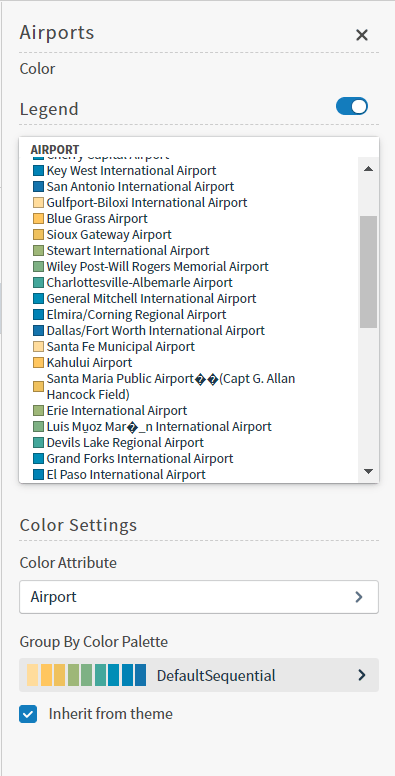
Select the color icon on the sidebar menu. The Color sidebar for the visual appears.
-
Configure the color settings as described below. As you change the color settings, the legend at the top of the Color sidebar shows how the legend will appear on the visual. Supported color specifications are described in Specify Colors.
Setting Description Legend Enable or disable to display a dynamic legend in this visual. Dynamic legends allow you to temporarily add or remove data shown in the visual. - For distinct color styles, select a data point in the legend to turn it off and on in the visual.
- Use the color selector to manually assign colors for legend items.
If available, enable or disable a static legend for this visual.Color Attribute Select the attribute that affects the segment color in the visual. Group By Color Palette Select a color palette for this specific visual.
Select the Inherit from theme checkbox to use the color palette specified by the theme. - Close the Color sidebar and the color settings are dynamically applied to the visual.
- Select the save icon to save the dashboard and the visual with its updated settings.
Donut Charts
Donut charts are based on one metric and one attribute. They are supported by all Self-Service Analytics data connectors. This topic describes:Configure Settings for a Specific Donut Chart
Change the settings for a specific donut chart- Edit the donut chart you want to modify. See Edit Visuals.
- If you are editing the visual in a dashboard, select Settings from the visual drop-down menu. The sidebar menu for the visual appears. If you are editing the visual from the Visual Gallery, the sidebar appears to the right of the visual.
-
Select
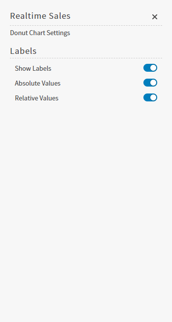
 on the sidebar menu. The Donut Chart Settings sidebar for the visual appears.
-
Alter the settings as needed:
- Optionally, edit the number or date and time format for this visual. See Number and Date Formatting for Visuals and Configure Date and Time Formatting.
-
Select
 to save the dashboard and the visual with its updated settings.
Configure Colors for a Specific Donut Chart
Specify the color settings for a specific donut chart using the Color sidebar- Edit the visual you want to modify. See Edit Visuals.
-
If you are editing the visual in a dashboard, select Settings from the drop-down menu. The sidebar menu for the visual appears. If you are editing the visual from the Visual Gallery, the sidebar appears to the right of the visual.
Select the color icon on the sidebar menu. The Color sidebar for the visual appears.
-
Configure the color settings as described below. As you change the color settings, the legend at the top of the Color sidebar shows how the legend will appear on the visual. Supported color specifications are described in Specify Colors.
Setting Description Legend Enable or disable to display a dynamic legend in this visual. Dynamic legends allow you to temporarily add or remove data shown in the visual. - For distinct color styles, select a data point in the legend to turn it off and on in the visual.
- Use the color selector to manually assign colors for legend items.
If available, enable or disable a static legend for this visual.Color Attribute Select the attribute that affects the segment color in the visual. Group By Color Palette Select a color palette for this specific visual.
Select the Inherit from theme checkbox to use the color palette specified by the theme. - Close the Color sidebar and the color settings are dynamically applied to the visual.
- Select the save icon to save the dashboard and the visual with its updated settings.
Sunburst
Use sunburst visuals to display up to three levels of hierarchical data in a circle format. The topmost hierarchical data is shown in the center of the sunburst, and the secondary levels are shown in levels further out from the center. You can include a third level of hierarchical data by enabling Enable Level 3 Group in the settings sidebar menu of the visual.To edit the number or date and time format for this visual, see Number and Date Formatting for Visuals and Configure Date and Time Formatting.
| Connector | Supported? | Notes |
|---|---|---|
| Amazon Redshift | Y | |
| Amazon S3 | Y | |
| Apache Drill | Y | |
| Apache Phoenix | Y | |
| Apache Phoenix Query Server (QS) | Y | |
| Apache Solr | Y | |
| BigQuery | Y | If you need to access a BigQuery partition, explicitly include an alias for the built in partition column in your select clause, such as select *, _PARTITIONTIME as pt from projectId.datasetId.tableId. |
| Cloudera Impala | Y | |
| Cloudera Search | Y | |
| Couchbase | Y | |
| Dremio | Y | |
| Dundas BI (Managed) | source-dependent | |
| Elasticsearch 7.0 | Y | |
| Elasticsearch 8.0 | Y | |
| File Upload (Upload API) | Y | |
| HDFS | Y | |
| Hive | Y | |
| Jira | Y | |
| MemSQL | Y | |
| Microsoft SQL Server | Y | |
| MongoDB | Y | |
| MySQL | Y | |
| Oracle | Y | |
| PostgreSQL | Y | |
| Python | Y | |
| Real Time Sales | Y | |
| Salesforce | Y | |
| SAP Hana | Y | |
| SAP IQ | Y | |
| SAP S/4HANA | Y | |
| Spark SQL | Y | |
| Snowflake | Y | |
| Teradata | Y | |
| TIBCO DV | Y | |
| Trino | Y | |
| File Upload (Upload API) | Y | |
| Vertica | Y |
Sort Data in a Sunburst Visual
Data in your visual is sorted Top of the Top if only two groups are included in the visual. When you add a third group by enabling Enable Level 3 Group, simple sort is used instead.Configure Colors for a Specific Sunburst
Specify the color settings for a specific sunburst using the Color sidebar- Edit the visual you want to modify. See Edit Visuals.
-
If you are editing the visual in a dashboard, select Settings from the visual drop-down menu. The sidebar menu for the visual appears. If you are editing the visual from the Visual Gallery, the sidebar appears to the right of the visual.
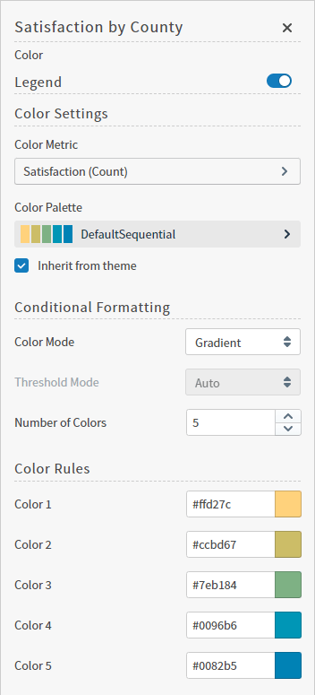
Select the color icon on the sidebar menu. The Color sidebar for the visual appears.
-
Configure the color settings as described below. As you change the color settings, the legend at the top of the Color sidebar shows how the legend will appear on the visual. Supported color specifications are described in Specify Colors.
Setting Description Legend Enable or disable to display a dynamic legend in this visual. Dynamic legends allow you to temporarily add or remove data shown in the visual. - For distinct color styles, select a data point in the legend to turn it off and on in the visual.
- Use the color selector to manually assign colors for legend items.
Color Metric Select the metric that affects the segment color in the visual. You can also define the default aggregation function used for the metric values: SUM, AVG, MAX, MIN, or (for some data sources) LAST VALUE. See Metric Aggregation Functions. Color Palette If a color palette is specified for this visual type in the data source defaults, select the color palette for this specific visual. If a color range is selected for KPI visuals in the data source defaults, this setting is not available. Select the Inherit from theme checkbox to use the color palette specified by the theme. Color Mode Select Distinct Colors or Gradient to identify the way colors are used on the screen. Either specific distinct colors will be used or a gradient of colors will be used. Threshold Mode If you selected the Gradient color mode, this setting cannot be changed. If you selected the Distinct Colors color mode, select either Auto or Manual from the drop-down list. Auto will automatically assign thresholds and colors for the visual. Manual allows you to change the thresholds and colors used on the visual. Number of colors Specify the number of colors to use for the visual. Color Rules Color rules allow you to change the colors for each color used for the visual. In addition, if you specified a Manual threshold mode, you can select the thresholds used for color settings in the visual. - Close the Color sidebar and the color settings are dynamically applied to the visual.
- Select the save icon to save the dashboard and the visual with its updated settings.
Tree Maps
Tree maps are based on two metrics and one attribute. They are supported by all Self-Service Analytics data connectors.To edit the number or date and time format for this visual, see Number and Date Formatting for Visuals and Configure Date and Time Formatting.
Configure Colors for a Specific Tree Map
Specify the color settings for a specific tree map using the Color sidebar- Edit the visual you want to modify. See Edit Visuals.
- If you are editing the visual in a dashboard, select Settings from the drop-down menu. The sidebar menu for the visual appears. If you are editing the visual from the Visual Gallery, the sidebar appears to the right of the visual. Select the color icon on the sidebar menu. The Color sidebar for the visual appears.
-
Configure the color settings as described below. As you change the color settings, the legend at the top of the Color sidebar shows how the legend will appear on the visual. Supported color specifications are described in Specify Colors.
Setting Description Legend Enable or disable to display a dynamic legend in this visual. Dynamic legends allow you to temporarily add or remove data shown in the visual. - For distinct color styles, select a data point in the legend to turn it off and on in the visual.
- For gradient color styles, use the legend’s gradient slider to show and hide your data.
If available, enable or disable a static legend for this visual.Color Metric Select the metric that affects the segment color in the visual. <type> Color Palette If Inherit from Theme is selected, the color palette is determined by the theme selected for your software UI.
To override the palette selected by the theme, clear the Inherit from Theme checkbox and select a different color palette.Color Mode Select Distinct Colors or Gradient to identify the way colors are used on the screen.
Either specific distinct colors will be used or a gradient of colors will be used.Threshold Mode If you selected the Gradient color mode, this setting cannot be changed. If you selected the Distinct Colors color mode, select either Auto or Manual from the drop-down list.
Auto will automatically assign thresholds and colors for the visual.
Manual enables you to change the thresholds and colors used on the visual.Number of colors Specify the number of colors to use for the visual. Color Rules Color rules allow you to change the colors for each color used for the visual.
In addition, if you specified a Manual threshold mode, you can select the thresholds used for color settings in the visual. - Close the Color sidebar and the color settings are dynamically applied to the visual.
- Select the save icon to save the dashboard and the visual with its updated settings.
Understand Visual Color Condition Thresholds
You can set threshold color conditions for metric-based visuals. At least two color settings are required. In addition, thresholds are specified between each color setting. (So three color settings require two threshold settings; four color settings require three threshold settings, etc.)- The color for Color 1 is used when the value of the color metric is less than the first threshold value.
- The color for Color 2 is used when the value of the color metric falls between the first and second threshold values.
- If only three colors are used for the visual, the color for Color 3 is used when the value of the color metric is greater than or equal to the second threshold value. If more than three colors are used, the color for Color 3 is used when the value of the color metric falls between the second and third threshold values. When more than three colors are used, the colors continue to be applied in this pattern for all threshold settings; any color metric values greater than the last threshold setting have the final color applied.
Word Clouds
Word clouds are based on two metrics and one attribute. They are supported by all Self-Service Analytics data connectors.To edit the number or date and time format for this visual, see Number and Date Formatting for Visuals and Configure Date and Time Formatting.
Configure Colors for a Specific Word Cloud
Specify the color settings for a specific word cloud using the Color sidebar- Edit the visual you want to modify. See Edit Visuals.
- If you are editing the visual in a dashboard, select Settings from the drop-down menu. The sidebar menu for the visual appears. If you are editing the visual from the Visual Gallery, the sidebar appears to the right of the visual. Select the color icon on the sidebar menu. The Color sidebar for the visual appears.
-
Configure the color settings as described below. As you change the color settings, the legend at the top of the Color sidebar shows how the legend will appear on the visual. Supported color specifications are described in Specify Colors.
Setting Description Legend Enable or disable to display a dynamic legend in this visual. Dynamic legends allow you to temporarily add or remove data shown in the visual. - For distinct color styles, select a data point in the legend to turn it off and on in the visual.
- For gradient color styles, use the legend’s gradient slider to show and hide your data.
If available, enable or disable a static legend for this visual.Color Metric Select the metric that affects the segment color in the visual. <type> Color Palette If Inherit from Theme is selected, the color palette is determined by the theme selected for your software UI.
To override the palette selected by the theme, clear the Inherit from Theme checkbox and select a different color palette.Color Mode Select Distinct Colors or Gradient to identify the way colors are used on the screen.
Either specific distinct colors will be used or a gradient of colors will be used.Threshold Mode If you selected the Gradient color mode, this setting cannot be changed. If you selected the Distinct Colors color mode, select either Auto or Manual from the drop-down list.
Auto will automatically assign thresholds and colors for the visual.
Manual enables you to change the thresholds and colors used on the visual.Number of colors Specify the number of colors to use for the visual. Color Rules Color rules allow you to change the colors for each color used for the visual.
In addition, if you specified a Manual threshold mode, you can select the thresholds used for color settings in the visual. - Close the Color sidebar and the color settings are dynamically applied to the visual.
- Select the save icon to save the dashboard and the visual with its updated settings.
Understand Visual Color Condition Thresholds
You can set threshold color conditions for metric-based visuals. At least two color settings are required. In addition, thresholds are specified between each color setting. (So three color settings require two threshold settings; four color settings require three threshold settings, etc.)- The color for Color 1 is used when the value of the color metric is less than the first threshold value.
- The color for Color 2 is used when the value of the color metric falls between the first and second threshold values.
- If only three colors are used for the visual, the color for Color 3 is used when the value of the color metric is greater than or equal to the second threshold value. If more than three colors are used, the color for Color 3 is used when the value of the color metric falls between the second and third threshold values. When more than three colors are used, the colors continue to be applied in this pattern for all threshold settings; any color metric values greater than the last threshold setting have the final color applied.
Packed Bubble Charts
Packed bubble charts are based on two metrics and one attribute. They are supported by all Self-Service Analytics data connectors.To edit the number or date and time format for this visual, see Number and Date Formatting for Visuals and Configure Date and Time Formatting.
Configure Colors for a Specific Packed Bubble Chart
Specify the color settings for a specific packed bubble chart using the Color sidebar- Edit the visual you want to modify. See Edit Visuals.
- If you are editing the visual in a dashboard, select Settings from the drop-down menu. The sidebar menu for the visual appears. If you are editing the visual from the Visual Gallery, the sidebar appears to the right of the visual. Select the color icon on the sidebar menu. The Color sidebar for the visual appears.
-
Configure the color settings as described below. As you change the color settings, the legend at the top of the Color sidebar shows how the legend will appear on the visual. Supported color specifications are described in Specify Colors.
Setting Description Legend Enable or disable to display a dynamic legend in this visual. Dynamic legends allow you to temporarily add or remove data shown in the visual. - For distinct color styles, select a data point in the legend to turn it off and on in the visual.
- For gradient color styles, use the legend’s gradient slider to show and hide your data.
If available, enable or disable a static legend for this visual.Color Metric Select the metric that affects the segment color in the visual. <type> Color Palette If Inherit from Theme is selected, the color palette is determined by the theme selected for your software UI.
To override the palette selected by the theme, clear the Inherit from Theme checkbox and select a different color palette.Color Mode Select Distinct Colors or Gradient to identify the way colors are used on the screen.
Either specific distinct colors will be used or a gradient of colors will be used.Threshold Mode If you selected the Gradient color mode, this setting cannot be changed. If you selected the Distinct Colors color mode, select either Auto or Manual from the drop-down list.
Auto will automatically assign thresholds and colors for the visual.
Manual enables you to change the thresholds and colors used on the visual.Number of colors Specify the number of colors to use for the visual. Color Rules Color rules allow you to change the colors for each color used for the visual.
In addition, if you specified a Manual threshold mode, you can select the thresholds used for color settings in the visual. - Close the Color sidebar and the color settings are dynamically applied to the visual.
- Select the save icon to save the dashboard and the visual with its updated settings.
Understand Visual Color Condition Thresholds
You can set threshold color conditions for metric-based visuals. At least two color settings are required. In addition, thresholds are specified between each color setting. (So three color settings require two threshold settings; four color settings require three threshold settings, etc.)- The color for Color 1 is used when the value of the color metric is less than the first threshold value.
- The color for Color 2 is used when the value of the color metric falls between the first and second threshold values.
- If only three colors are used for the visual, the color for Color 3 is used when the value of the color metric is greater than or equal to the second threshold value. If more than three colors are used, the color for Color 3 is used when the value of the color metric falls between the second and third threshold values. When more than three colors are used, the colors continue to be applied in this pattern for all threshold settings; any color metric values greater than the last threshold setting have the final color applied.