
Arc Gauges
Arc gauges are based on a single metric. They are supported by all Self-Service Analytics data connectors.Display Arc Gauge Label Description
You can show a description of the arc gauge label. The label shows the value that is plotted, but the label description shows the calculation for the plotted value in the format<actual value>/<maximum value>. By default, the label description is not shown.
To display the arc gauge label description:
- Edit the visual you want to modify. See Edit Visuals.
-
Select the settings icon on the visual sidebar. The Settings sidebar menu for the visual appears.
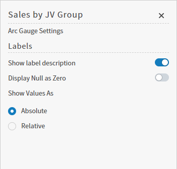
- Slide the Show label description switch on (to the right). The changes are made to the arc gauge and the label description is shown.
- Optionally, enable Display Null as Zero by sliding the switch on (to the right).
- Select the save icon to save the visual.
Adjust the Arc Gauge Value Range
Configure minimum and maximum arc gauge values for a specific arc gauge- Edit the visual you want to modify. See Edit Visuals.
-
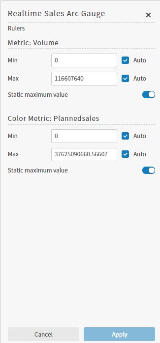
Select the rulers icon on the visual sidebar. The Rulers sidebar for the visual appears.
-
In the Metric section of the sidebar, configure the settings as described below.
Setting Description Min Specify the minimum value for the gauge. Select the Auto checkbox to have Self-Service Analytics automatically determine the minimum value from the data for the arc gauge metric. Min If the Static maximum value switch is on, specify the maximum value for the gauge. Select the Auto checkbox to have Self-Service Analytics automatically determine the maximum value from the data for the arc gauge metric.
If the Static maximum value switch is off, select a second metric to use for the maximum value of the gauge. For example, if the arc metric was the number of apples, you might select a second metric representing the total number of fruit. In this way, the arc gauge would plot the total number of apples as it relates to the total number of fruit.Static maximum value This switch allows you to plot the arc gauge metric as it relates to a second metric.
By default, this switch is on. When it is on, the maximum value of the arc gauge is determined by the Max setting for the arc metric or the maximum value of the data for the selected arc metric. Only the values of the selected arc metric are used.
You can select and format the numeric attribute used for this field. See Number and Date Formatting for Visuals.
Slide the Static maximum value switch off (to the left) to select a second metric to use for the maximum value of the gauge. - Select Apply. The changes are made to the arc gauge.
- Select the save icon to save the visual.
Adjust Arc Gauge Color Metric Value Range
The color metric determines the color used by the arc gauge. Color settings are mostly specified on the Color sidebar for the arc gauge, but you can adjust the range for the color metric of an arc gauge using the Rulers sidebar. Configure minimum and maximum values for the color metric selected for a specific arc gauge- Edit the visual you want to modify. See Edit Visuals.
- Select the rulers icon on the visual sidebar. The Rulers sidebar for the visual appears.
-
In the Color Metric section of the sidebar, configure the settings as described below.
Setting Description Min Specify the minimum value for the color metric. Select the Auto checkbox to have Self-Service Analytics automatically determine the minimum value from the data for the color metric. Max If the Static maximum value switch is on, specify the maximum value of the color metric used for the arc gauge. Select the Auto checkbox to have Self-Service Analytics automatically determine the maximum value from the color metric.
If the Static maximum value switch is off, select a second metric to use for the maximum value of the color metric used for the arc gauge.Static maximum value This switch allows you to set the color of the arc gauge as it relates to a second metric.
By default, this switch is on. When it is on, the color range of the arc gauge is determined by the Max setting for the color metric or the maximum value of the data for the selected color metric. Only the values of the selected color metric are used.
Slide the Static maximum value switch off (to the left) to select a different metric to use for the color of the gauge. - Select Apply. The changes are made to the arc gauge.
- Select the save icon to save the visual.
Display Arc Gauge Values as Percentages
When you first create an arc gauge visual, the values shown on the gauge are the raw values of the plotted metric. You can alter this to show the values as a percentage of the maximum value of the gauge. Display arc gauge values as percentages in an a specific arc gauge- Edit the visual you want to modify. See Edit Visuals.
- Select the settings icon on the visual sidebar. The Settings sidebar for the visual appears. The arc gauge shows raw values by default.
- Under Show Values As, select Relative. The arc gauge values are shown as percentages. To show raw values again, select Absolute. This is the default setting.
- After making your display choice, select the save icon to save the visual.
Configure Colors for a Specific Arc Gauge
Specify the color settings for a specific arc gauge using the Color sidebar- Edit the visual you want to modify. See Edit Visuals.
-
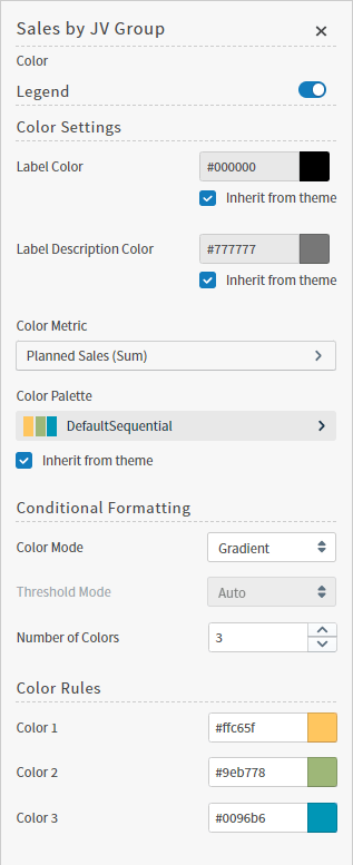
Select the color icon on the visual sidebar. The Color sidebar menu for the visual appears.
-
Configure the color settings as described below. As you change the color settings, the legend at the top of the Color sidebar shows how the legend will appear on the visual. Supported color specifications are described in Specify Colors.
Setting Description Legend Enable or disable to display a dynamic legend in this visual. Dynamic legends allow you to temporarily add or remove data shown in the visual. - For distinct color styles, select a data point in the legend to turn it off and on in the visual.
- For gradient color styles, use the legend’s gradient slider to show and hide your data.
If available, enable or disable a static legend for this visual.Label Color The inherited label color from the theme. Select to clear the Inherit from theme checkbox to define a different color manually. Label Description Color Select a color for the label description. Select the Inherit from theme checkbox to use the color palette specified by the theme. Color Metric Select the metric that affects the segment color in the visual. You can also define the default aggregation function used for the metric values: SUM, AVG, MAX, MIN, or (for some data sources) LAST VALUE. See Metric Aggregation Functions. Color Palette If a color palette is specified for this visual type in the data source defaults, select the color palette for this specific visual. If a color range is selected for KPI visuals in the data source defaults, this setting is not available. Select the Inherit from theme checkbox to use the color palette specified by the theme. Color Mode Select Distinct Colors or Gradient to identify the way colors are used on the screen. Your selection determines if specific distinct colors or a gradient of colors are used. Threshold Mode If you select the Gradient color mode, this setting cannot be changed.
If you select the Distinct Colors color mode, select either Auto or Manual from the drop-down list.- Auto: Automatically assigns thresholds and colors for the visual.
- Manual: You can change the thresholds and colors used in the visual.
Number of colors Specify the number of colors to use for the visual. Color Rules Change the assigned color for each color used for the visual.
If you specify Manual threshold mode, select the thresholds used for color settings in the visual.Thresholds in Percentage This switch allows you to set the color thresholds for the arc gauge in percentages. Slide the Thresholds in percentage switch on (to the right) to specify color thresholds in percentages.
By default, this switch is off and color threshold settings must be raw values.
This setting is only available if Threshold Mode is set to Manual. - Close the Color sidebar and the color settings are dynamically applied to the visual.
- Select the save icon to save the dashboard and the visual with its updated settings.
Understand Visual Color Condition Thresholds
You can set threshold color conditions for metric-based visuals. At least two color settings are required. In addition, thresholds are specified between each color setting. (So three color settings require two threshold settings; four color settings require three threshold settings, etc.)- The color for Color 1 is used when the value of the color metric is less than the first threshold value.
- The color for Color 2 is used when the value of the color metric falls between the first and second threshold values.
- If only three colors are used for the visual, the color for Color 3 is used when the value of the color metric is greater than or equal to the second threshold value. If more than three colors are used, the color for Color 3 is used when the value of the color metric falls between the second and third threshold values. When more than three colors are used, the colors continue to be applied in this pattern for all threshold settings; any color metric values greater than the last threshold setting have the final color applied.
Bullet Gauges
Bullet gauges are based on a single metric. The metric is mapped against a background bar that shows value ranges using color. A metric scale is also shown. Finally, a small vertical bar represents a marker for the target value of the metric. Bullet gauges are supported by all Self-Service Analytics data connectors.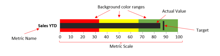
- Configure Settings for a Specific Bullet Gauge
- Adjust the Bullet Gauge Value Range
- Configure Colors for a Specific Bullet Gauge
- Understand Visual Color Condition Thresholds
- Understand Visual Color Condition Thresholds
Configure Settings for a Specific Bullet Gauge
Change the settings for a specific bullet gauge- Edit the bullet gauge you want to modify. See Edit Visuals.
- If you are editing the visual in a dashboard, select Settings from the visual drop-down menu. The sidebar menu for the visual appears. If you are editing the visual from the Visual Gallery, the sidebar appears to the right of the visual.
-
Select
 on the sidebar menu. The Bullet Gauge Settings sidebar for the visual appears.
-
Alter the settings as needed:
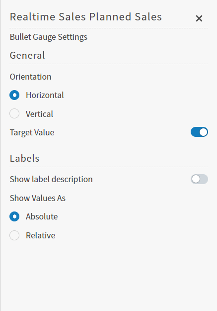
Setting Description Orientation Select an orientation (horizontal or vertical) for the bullet gauge. Target Value Slide the Target Value slider on (to the right) to show the target value bar on the gauge. Show label description Slide the Show label description slider on (to the right) to show label description on the gauge. The label description includes the metric value and maximum value in addition to the metric name.
For example, when this slider is on, if the Planned Sales metric value is 15,000 and its maximum value is 32,000, the label description would read “Planned Sales 15,000 of 32,000”. When this slider is off, only “Planned Sales” would show.When Show Values As is set to Relative and Show label description is on, the percentage of the metric value in relation to the maximum value is also shown.Show Values As Select how values should be shown on the gauge. Select Absolute to show raw data values. Select Relative to show percentages. -
Select
 to save the dashboard and the visual with its updated settings.
Adjust the Bullet Gauge Value Range
Configure minimum and maximum values for a specific bullet gauge- Edit the visual you want to modify. See Edit Visuals.
-
Select
 on the visual sidebar. The Rulers sidebar for the visual appears.
-
In the Metric section of the sidebar, configure the settings as described below.
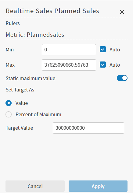
Setting Description Min Specify the minimum value for the gauge. Select the Auto checkbox to have Self-Service Analytics automatically determine the minimum value from the data for the bullet gauge metric. Max If the Static maximum value switch is on, specify the maximum value for the gauge. Select the Auto checkbox to have Self-Service Analytics automatically determine the maximum value from the data for the bullet gauge metric.
If the Static maximum value switch is off, select a second metric to use for the maximum value of the gauge. For example, if the bullet gauge metric was the number of apples, you might select a second metric representing the total number of fruit. In this way, the bullet gauge would plot the total number of apples as it relates to the total number of fruit.Static maximum value This switch allows you to plot the bullet gauge metric as it relates to a second metric.
By default, this switch is on. When it is on, the maximum value of the bullet gauge is determined by the Max setting for the bullet gauge metric or the maximum value of the data for the selected bullet gauge metric. Only the values of the selected bullet gauge metric are used.
You can select and format the numeric attribute used for this field. See Number and Date Formatting for Visuals.
Slide the Static maximum value switch off (to the left) to select a second metric to use for the maximum value of the gauge.Set Target As Select how the target value for the bullet gauge metric is set. Select Value if a raw data value should be used. Select Percent of Maximum if a percentage of the maximum value should be used. Target Value Specify a target value for the bullet gauge metric.
If Set Target As is set to Percent of Maximum, this field name changes to Target Value (%). In this case, remember to specify the target value as a percentage of the maximum value for the gauge. - Select Apply. The changes are made to the bullet gauge.
-
Select the Save icon () to save the visual.
Configure Colors for a Specific Bullet Gauge
Specify the color settings for a specific bullet gauge using the Color sidebar- Edit the visual you want to modify. See Edit Visuals.
-
If you are editing the visual in a dashboard, select Settings from the drop-down menu. The sidebar menu for the visual appears. If you are editing the visual from the Visual Gallery, the sidebar appears to the right of the visual.
Select
 on the sidebar menu. The Color sidebar for the visual appears.
-
Configure the color settings as described below. As you change the color settings, the legend at the top of the Color sidebar shows how the legend will appear on the visual. Supported color specifications are described in Specify Colors.
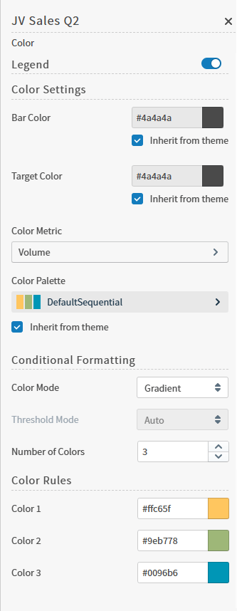
Setting Description Legend Enable or disable to display a dynamic legend in this visual. Dynamic legends allow you to temporarily add or remove data shown in the visual. - For distinct color styles, select a data point in the legend to turn it off and on in the visual.
- For gradient color styles, use the legend’s gradient slider to show and hide your data.
If available, enable or disable a static legend for this visual.Bar Color Select the bar color for the gauge.
If Inherit from Theme is selected, the color palette is determined by the theme selected for the Self-Service Analytics UI. You cannot select the color in this field to access the color dialog.Target Color Select the color for the target bar.
If Inherit from Theme is selected, the color palette is determined by the theme selected for the Self-Service Analytics UI. You cannot select the color in this field to access the color dialog.Color Metric Select the metric that affects the segment color in the visual. You can also define the default aggregation function used for the metric values: SUM, AVG, MAX, MIN, or (for some data sources) LAST VALUE.
See Metric Aggregation Functions.Color Palette If Inherit from Theme is selected, the color palette is determined by the theme selected for the Self-Service Analytics UI.
To override the palette selected by the theme, clear the Inherit from Theme checkbox and select a different color palette.Color Mode Select Distinct Colors or Gradient to identify the way colors are used on the screen. Either specific distinct colors will be used or a gradient of colors will be used. Threshold Mode If you selected the Gradient color mode, this setting cannot be changed. If you selected the Distinct Colors color mode, select either Auto or Manual from the drop-down list.
Auto will automatically assign thresholds and colors for the visual. Manual allows you to change the thresholds and colors used on the visual.Number of colors Specify the number of colors to use for the visual. Color Rules Color rules allow you to change the colors for each color used for the visual. In addition, if you specified a Manual threshold mode, you can select the thresholds used for color settings in the visual.
See Understand Visual Color Condition Thresholds. - Close the Color sidebar and the color settings are dynamically applied to the visual.
- Select the save icon to save the dashboard and the visual with its updated settings.
Understand Visual Color Condition Thresholds
You can set threshold color conditions for metric-based visuals. At least two color settings are required. In addition, thresholds are specified between each color setting. (So three color settings require two threshold settings; four color settings require three threshold settings, etc.)- The color for Color 1 is used when the value of the color metric is less than the first threshold value.
- The color for Color 2 is used when the value of the color metric falls between the first and second threshold values.
- If only three colors are used for the visual, the color for Color 3 is used when the value of the color metric is greater than or equal to the second threshold value. If more than three colors are used, the color for Color 3 is used when the value of the color metric falls between the second and third threshold values. When more than three colors are used, the colors continue to be applied in this pattern for all threshold settings; any color metric values greater than the last threshold setting have the final color applied.
KPI Charts
KPI charts are based on two metrics: a primary metric and a comparison metric. They allow you to visualize the results of comparing the metrics and show positive or negative dynamics. KPI charts are supported by all Self-Service Analytics data connectors. This topic describes:Configure Settings for a Specific KPI Chart
Change the settings for a specific KPI chart- Edit the KPI chart you want to modify. See Edit Visuals.
- If you are editing the visual in a dashboard, select Settings from the visual drop-down menu. The sidebar menu for the visual appears. If you are editing the visual from the Visual Gallery, the sidebar appears to the right of the visual.
-
Select settings on the sidebar menu. The KPI Chart Settings sidebar for the visual appears.
-
Alter the settings as needed:
General
Comparison Mode
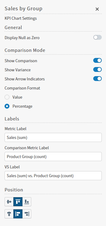
Setting Description Show Comparison Enable Show Comparison to show comparison data. Show Variance Enable Show Variance to see variance data. Show Arrow Indicators Enable Show Arrow Indicator to show up and down arrows that indicate whether the change is positive or negative. Show Comparison Enable Show Comparison to show comparison data. Comparison Format If the Show Comparison option is enabled, select an option to show variance data as raw data or as percentages.
Select Value to see raw data differences; select Percentage to see percentages. - Optionally, edit the number format for this visual. See Number and Date Formatting for Visuals.
-
Select the Save icon to save the visual and dashboard or the visual with its updated settings.
Configure Colors for a Specific KPI Chart
Define the look and feel of your KPI using the Color sidebar to define a Color Palette and Color Rules. You can apply a color palette to the Color Metric of the visual, and color rules to one or more parts of the visual. Optionally, add conditions to color rules to change the appearance of your visual when specific conditions are met. Rules are applied in the order they are listed in the Color Rules work area. If two rules are applied to the same Target, the first rule is applied, and may be overwritten by the second rule. Select and drag a rule to reorder as needed. Specify a Color Palette for the Color Metric- Edit the visual you want to modify. See Edit Visuals.
-
If you are editing the visual in a dashboard, select Settings from the drop-down menu. The sidebar menu for the visual appears. If you are editing the visual from the Visual Gallery, the sidebar appears to the right of the visual.
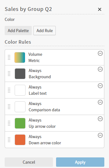
Select the colors icon on the sidebar menu. The Color sidebar for the visual appears.
-
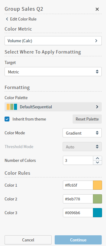
Select the color rule for the Color Metric. In this example, the top rule, Volume Metric, which displays the gradient color indicator. The Color Metric work area opens.
-
Configure the color settings as described below. Supported color specifications are described in Specify Colors.
Setting Description Color Metric Select to open the Choose a Field work area. Select a field to use as the Color Metric for this visual, then select Continue to return to the Color Metric work area.
The metric you select affects the segment color in the visual. You can also define the default aggregation function used for the metric values: SUM, AVG, MAX, MIN, or (for some data sources) LAST VALUE. See Metric Aggregation Functions.Select Where To Apply Formatting Select an element of the visual to use the color palette.
Target options include: Background, Metric, Label text, Comparison data, Up arrow color, or Down arrow color.Formatting Change or define the Color Palette, enable or disable Inherit from Theme, Reset Palette, define a Color Mode, Threshold Mode, and Number of Colors available in Color Rules. Inherit from Theme If Inherit from Theme is selected, the color palette is determined by the theme selected for the Self-Service Analytics UI. To override the palette selected by the theme, clear the Inherit from Theme checkbox. You can then either: - Select a different color palette from predefined color palettes
- Change the colors defined in the next work area, Color Rules
Reset Palette Select to reset the color palette if you have made changes to any individual colors in the next work area, Color Rules. Color Mode Select Distinct Colors or Gradient to identify the way colors are used on the screen. Either specific distinct colors will be used or a gradient of colors will be used. Threshold Mode If you selected the Gradient color mode, this setting cannot be changed. If you selected the Distinct Colors color mode, select either Auto or Manual from the drop-down list. Auto will automatically assign thresholds and colors for the visual. Manual allows you to change the thresholds and colors used on the visual. Number of Colors Select the number of colors to use in the next work area, Color Rules. Color Rules These Color Rules allow you to change the colors for each color used for the visual. In addition, if you specified a Manual threshold mode, you can select the thresholds used for color settings in the visual. -
Select Apply to apply your changes to the visual.
If you delete the Color Metric rule, create a new one by selecting Add Palette.
- Edit the visual you want to modify. See Edit Visuals.
-
If you are editing the visual in a dashboard, select Settings from the drop-down menu. The sidebar menu for the visual appears. If you are editing the visual from the Visual Gallery, the sidebar appears to the right of the visual.
Select the colors icon on the sidebar menu. The Color sidebar for the visual appears.
-
Select Add Rule to add a new color rule, or select a Color Rule to edit. The Color Rule work area opens.
 Select the delete icon to delete a color rule or formatting definition.
 -
Configure the color settings as described below. If a target is not assigned a rule, its color settings are inherited from the Self-Service Analytics theme, regardless of other settings. Supported color specifications are described in Specify Colors.
Setting Description Select When to Apply Formatting If Always apply this rule is disabled, you can select the add icon to define the conditions to apply your formatting for the selected Target.
See Configure Conditional Formatting Rules.Always apply this rule Enable to always apply the formatting to the selected Target.
Disable to define conditions for applying this rule.Select Where To Apply Formatting Select an element of the visual to use the color rules. Target options include: Background, Metric, Label text, Comparison data, Up arrow color, or Down arrow color. Formatting Select the add icon to define the conditions to apply your formatting for the selected Target.
If all format definitions have been defined for the target, this option is not available. The format definitions you can apply to a target vary depending on the target selected.Text Color The text color for the selected target.
Clear the Inherit from Theme checkbox to select a different color.
Select to enable the Optimize contrast option. This defines the color as Auto, and is black or white, depending on the color defined for the Background target.Background Color Define the background color for the selected target.
For the Metric, Label text, and Comparison data targets, this color acts as a highlight color behind the text or numbers.
For the Background target, this defines the background color of the visual. This color is used to select the Auto color for Text Color definitions that use the Optimize contrast option.Text Size Adjust the size of the selected target’s text. Bold, Italic, Underline Adjust the formatting of the selected target’s text. - Select Apply to apply your changes to the visual.
Configure Conditional Formatting Rules
Select a group attribute to define the values for applying the formatting rule. Optionally, select the add icon to add a derived field or custom metric.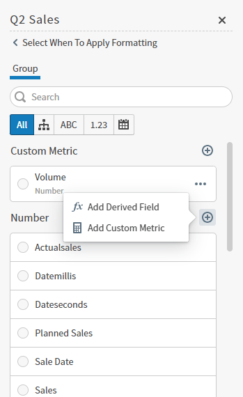
Metric
| Selection | Description |
|---|---|
| Operator | Select an operator to use. Options may include Between, Equal, Not Equal, Greater Than, Greater Than or Equal, Less Than, and Less than or Equal. Depending on the Operator you select, different definition fields are available to use. |
| From, To | Define a value range for Between. |
| Value | Define a value for Equal, Not Equal, Greater Than, Greater Than or Equal, Less Than, and Less than or Equal.
|
| Selection | Description |
|---|---|
| Range | Displays the range for this value. |
| Aggregation | Select the aggregation method you want to use. Available aggregation methods may include Avg, Min, Max, Sum, Last Value, Count, and Distinct Count. For information about aggregation methods, see Metric Aggregation Functions. |
| Operator | Select an operator to use. Options may include Between, Equal, Not Equal, Greater Than, Greater Than or Equal, Less Than, and Less than or Equal. Depending on the Operator you select, different definition fields are available to use. |
| From, To | Define a value range for Betweenand Not Between. |
| Value | Define a value for Equal, Not Equal, Greater Than, Greater Than or Equal, Less Than, and Less than or Equal. |