
Standard Bar Charts
Standard bar charts are based on one metric and one or two attributes, as follows:- Plain: Based on 1 metric and 1 attribute
- Clustered: Based on 1 metric and 2 attributes
- Stacked: Based on 1 metric and 2 attributes
- 100% Stacked: Based on 1 metric and 2 attributes
- Configure Settings for a Specific Bar Chart
- Configure Colors for a Specific Bar Chart
- Understand Visual Color Condition Thresholds
Configure Settings for a Specific Bar Chart
Change the settings for a specific bar chart- Edit the bar chart you want to modify. See Edit Visuals.
- If you are editing the visual in a dashboard, select Settings from the drop-down menu. The sidebar menu for the visual appears. If you are editing the visual from the Visual Gallery, the sidebar appears to the right of the visual.
-
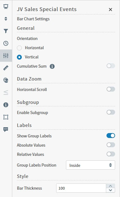
Select the settings icon on the sidebar menu. The Bar Chart Settings sidebar for the visual appears.
-
Alter the settings as needed:
Setting Description Orientation Select Horizontal or Vertical orientation for the bars. Cumulative Sum When enabled, Self-Service Analytics updates the visual to add the previous value to the next value, and both the original and cumulative value for selected items are displayed as a tool tip.
In Bar visuals, this feature is only available when data is grouped by a Time field, and when the Enable Subgroup setting is disabled.Horizontal Scroll Select to enable users to scroll and zoom data for this visual. Other settings you define for this visual may limit the availability of this option. Subgroup Slide on (to the right) the Enable Subgroup slider to enable a subgroup style. After enabling a subgroup style, select the style for the chart: Clustered Bar Chart, Stacked Bar Chart, or 100% Stacked Bar Chart.
If Subgroups are enabled, you can define the visibility and position of their labels.Show Group Labels Enable to display labels for group values. Absolute Values Enable to display the data in absolute values. Relative Values Enable to display the data in relative values. Group Labels Position or Subgroup Labels Position Select a position option for the group or subgroup labels: Outside horizontal, Outside diagonal, or Outside vertical. Style Specify the bar thickness for the chart. - Optionally, edit the number or date and time format for this visual. See Number and Date Formatting for Visuals and Configure Date and Time Formatting.
- Select the save icon to save the dashboard and the visual with its updated settings.
Configure Colors for a Specific Bar Chart
Specify the color settings for a specific bar chart using the Color sidebar- Edit the visual you want to modify. See Edit Visuals.
- If you are editing the visual in a dashboard, select Settings from the visual drop-down menu. The sidebar menu for the visual appears. If you are editing the visual from the Visual Gallery, the sidebar appears to the right of the visual. Select the color icon on the sidebar menu. The Color sidebar for the visual appears.
-
Configure the color settings as described below. As you change the color settings, the legend at the top of the Color sidebar shows how the legend will appear on the visual. Supported color specifications are described in Specify Colors.
Setting Description Legend Enable or disable to display a dynamic legend in this visual. Dynamic legends allow you to temporarily add or remove data shown in the visual. - For distinct color styles, select a data point in the legend to turn it off and on in the visual when Sub-Group is enabled.
- For gradient color styles, use the legend’s gradient slider to show and hide your data.
Label Color The inherited label color from the theme. Select to clear the Inherit from theme checkbox to define a different color manually. Color Metric Select the metric that affects the segment color in the visual. <type> Color Palette If Inherit from Theme is selected, the color palette is determined by the theme selected for the Self-Service Analytics UI.
To override the palette selected by the theme, clear the Inherit from Theme checkbox and select a different color palette.Color Mode Select Distinct Colors or Gradient to identify the way colors are used on the screen. Either specific distinct colors will be used or a gradient of colors will be used. Threshold Mode If you select the Gradient color mode, this setting cannot be changed.
If you select the Distinct Colors color mode, select either Auto or Manual from the drop-down list.- Auto: Automatically assigns thresholds and colors for the visual.
- Manual: You can change the thresholds and colors used in the visual.
Number of colors Specify the number of colors to use for the visual. Color Rules Change the assigned color for each color used for the visual.
If you specify Manual threshold mode, select the thresholds used for color settings in the visual. - Close the Color sidebar and the color settings are dynamically applied to the visual.
- Select the save icon to save the dashboard and the visual with its updated settings.
Understand Visual Color Condition Thresholds
You can set threshold color conditions for metric-based visuals. At least two color settings are required. In addition, thresholds are specified between each color setting. (So three color settings require two threshold settings; four color settings require three threshold settings, etc.)- The color for Color 1 is used when the value of the color metric is less than the first threshold value.
- The color for Color 2 is used when the value of the color metric falls between the first and second threshold values.
- If only three colors are used for the visual, the color for Color 3 is used when the value of the color metric is greater than or equal to the second threshold value. If more than three colors are used, the color for Color 3 is used when the value of the color metric falls between the second and third threshold values. When more than three colors are used, the colors continue to be applied in this pattern for all threshold settings; any color metric values greater than the last threshold setting have the final color applied.
Bars: Histograms
Histograms require only one metric (number). The metric data range is divided into intervals and the metric values that fall within each interval are counted. The histogram plots the value counts (Volume) against the metric intervals. Histograms are supported only by data sources that use connectors that support the calculations necessary for histogram visuals with integer values. Support for this feature by connector is shown in the following table. Key:Y - Supported; N - Not Supported; N/A - not applicable
Data from Fusion data sources can be used in histograms.
Configure Settings for a Specific Histogram
Change the settings for a specific histogram- Edit the histogram you want to modify. See Edit Visuals.
- If you are editing the visual in a dashboard, select Settings from the visual drop-down menu. The sidebar menu for the visual appears. If you are editing the visual from the Visual Gallery, the sidebar appears to the right of the visual.
-
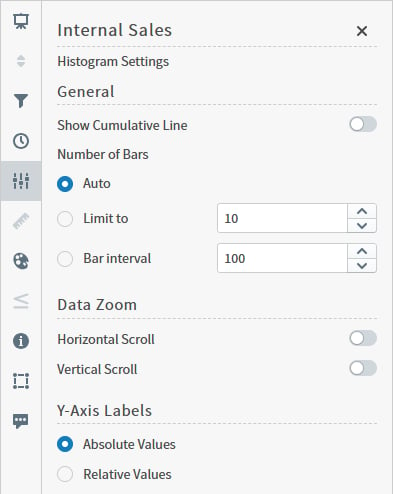
Select the settings icon on the sidebar menu. The Histogram Settings sidebar for the visual appears.
-
Alter the settings as needed:
Setting Description Show Cumulative Line Select to enable the cumulative line to be displayed on your visual. Number of Bars Specify the number of bars: - Auto - if you select this option, the bins for all your data set will be built and corresponding bars will be displayed.
- Limit to - specify the maximum number of bars to be displayed on your visual.
- Bar interval - specify the bar interval for your visual.
Horizontal Scroll, Vertical Scroll Select to enable users to scroll and zoom data for this visual. Other settings you define for this visual may limit the availability of this option. Y-Axis Labels Select Absolute Values, or Relative Values to use absolute or relative values. - Optionally, edit the number format for this visual. See Number and Date Formatting for Visuals.
- Select the save icon to save the dashboard and the visual with its updated settings.
Configure Colors for a Specific Histogram
Specify the color settings for a specific histogram using the Color sidebar- Edit the visual you want to modify. See Edit Visuals.
-
If you are editing the visual in a dashboard, select Settings from the visual drop-down menu. The sidebar menu for the visual appears. If you are editing the visual from the Visual Gallery, the sidebar appears to the right of the visual.
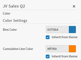
Select the color icon on the sidebar menu. The Color sidebar menu for the visual appears.
-
Configure the color settings as described below. Supported color specifications are described in Specify Colors.
- Close the Color sidebar and the color settings are dynamically applied to the visual.
- Select the save icon to save the dashboard and the visual with its updated settings.
Bars: Multiple Metric Charts
Multiple metric bar charts are based on multiple metrics and one attribute. They are supported by all Self-Service Analytics data connectors. This topic describes:- Configure Settings for a Specific Multiple Metric Bar Chart
- Configure Colors for a Specific Multiple Metric Bar Chart
Configure Settings for a Specific Multiple Metric Bar Chart
Change the settings for a specific multiple metric bar chart- Edit the multiple metric bar chart you want to modify. See Edit Visuals.
- If you are editing the visual in a dashboard, select Settings from the drop-down menu. The sidebar menu for the visual appears. If you are editing the visual from the Visual Gallery, the sidebar appears to the right of the visual.
-
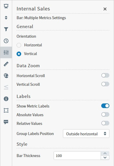
Select the settings icon on the sidebar menu. The Bar: Multiple Metrics Settings sidebar for the visual appears.
-
Alter the settings as needed:
- Optionally, edit the number or date and time format for this visual. See Number and Date Formatting for Visuals and Configure Date and Time Formatting.
- Select the save icon to save the dashboard and the visual with its updated settings.
Configure Colors for a Specific Multiple Metric Bar Chart
Specify the color settings for a specific multiple metric bar chart using the Color sidebar- Edit the visual you want to modify. See Edit Visuals.
- If you are editing the visual in a dashboard, select Settings from the visual drop-down menu. The sidebar menu for the visual appears. If you are editing the visual from the Visual Gallery, the sidebar appears to the right of the visual. Select the color icon on the sidebar menu. The Color sidebar for the visual appears.
-
Configure the color settings as described below. As you change the color settings, the legend at the top of the Color sidebar shows how the legend will appear on the visual. Supported color specifications are described in Specify Colors.
Setting Description Legend Enable or disable to display a dynamic legend in this visual. Dynamic legends allow you to temporarily add or remove data shown in the visual. - For distinct color styles, select a data point in the legend to turn it off and on in the visual.
- Use the color selector to manually assign colors for legend items.
If available, enable or disable a static legend for this visual.Label Color The inherited label color from the theme. Select to clear the Inherit from theme checkbox to define a different color manually. <type> Color Palette Select a color palette for this specific visual.
Select the Inherit from theme checkbox to use the color palette specified by the theme. - Close the Color sidebar and the color settings are dynamically applied to the visual.
- Select the save icon to save the dashboard and the visual with its updated settings.
Modify Bar Charts
When you first create a standard bar chart or a multiple metric bar chart, the default settings specified in the data source configuration are used to create the visuals. Use the Settings sidebar to further refine your selected bar chart.| Setting | Description |
|---|---|
| Orientation | Select Horizontal or Vertical orientation for the bars. |
| Cumulative Sum | When enabled, Self-Service Analytics updates the visual to add the previous value to the next value, and both the original and cumulative value for selected items are displayed as a tool tip. In Bar visuals, this feature is only available when data is grouped by a Time field, and when the Enable Subgroup setting is disabled. |
| Horizontal Scroll | Select to enable users to scroll and zoom data for this visual horizontally. Other settings you define for a visual may limit the availability of this option. |
| Subgroup | Slide on (to the right) the Enable Subgroup slider to enable a subgroup style. After enabling a subgroup style, select the style for the chart: Clustered Bar Chart, Stacked Bar Chart, or 100% Stacked Bar Chart. If Subgroups are enabled, you can define the visibility and position of their labels. |
| Show Group Labels | Enable to display labels for group values. |
| Absolute Values | Enable to display the data in absolute values. |
| Relative Values | Enable to display the data in relative values. |
| Group Labels Position or Subgroup Labels Position | Select a position option for the group or subgroup labels: Inside, Outside horizontal, Outside diagonal, or Outside vertical. |
| Style | Specify the bar thickness for the chart. |
Line Trend: Attribute Value Charts
Attribute value line charts are based on one metric, one attribute and one time attribute. Attribute value line charts are supported by all Self-Service Analytics data connectors except Cloudera Search. They are supported in this environment for Apache Solr connectors for version 5.2 or later. This topic describes:- Configure Settings for a Specific Attribute Value Line Chart
- Configure Colors for a Specific Attribute Value Line Chart
Configure Settings for a Specific Attribute Value Line Chart
Change the settings for a specific attribute value line chart- Edit the attribute value line chart you want to modify. See Edit Visuals.
- If you are editing the visual in a dashboard, select Settings from the visual drop-down menu. The sidebar menu for the visual appears. If you are editing the visual from the Visual Gallery, the sidebar appears to the right of the visual.
-
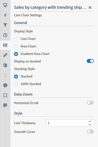
Select the settings icon on the sidebar menu. The Line Chart Settings sidebar for the visual appears.
-
Alter the settings as needed:
Setting Description Display Style Select Line Chart, Area Chart, or Gradient Area Chart to indicate the type of chart you want to see. Line Chart is selected by default. - Select Line Chart to display your data in a simple line format, using appropriate colors.
- Select Area Chart to display your data with a fill option for the line chart. This fills the visual with solid appropriate colors between the lines.
- Select Gradient Area Chart to display your data with a gradient fill option for the line chart. This fills the visual with a gradient of appropriate colors from opaque to transparent between the lines.
Display as stacked Slide this switch on (to the right) to display the visual as a stacked area chart. When turned on, the Stacking Style options become available. Stacking Style Select one of the stacking styles: Stacked or 100% Stacked. These options are only available if the Display as stacked switch is on. - The Stacked setting is the default and displays the plotted lines in a stacked format. Stacked charts are best used to show how individual values in the data relate to all of the other values for the same data.
- The 100% Stacked option displays the plotted lines in a stacked format but as they relate to a cumulative whole. The y-axis cumulative total is always represented as 100% in a 100% stacked format and all individual values are presented as percentages of the whole.
Horizontal Scroll Select to enable users to scroll and zoom data for this visual. Other settings you define for this visual may limit the availability of this option. Line Thickness Increase or decrease the thickness of the lines in the visual using the up and down arrows in this box. Smooth Curve Disabled by default. - When disabled, lines render with straight line segments between data points.
- When enabled, all line series are rendered with fluid spline interpolation.
- Optionally, edit the number or date and time format for this visual. See Number and Date Formatting for Visuals and Configure Date and Time Formatting.
- Select the save icon to save the dashboard and the visual with its updated settings.
Configure Colors for a Specific Attribute Value Line Chart
Specify the color settings for a specific attribute value line chart using the Color sidebar- Edit the visual you want to modify. See Edit Visuals.
-
If you are editing the visual in a dashboard, select Settings from the drop-down menu. The sidebar menu for the visual appears. If you are editing the visual from the Visual Gallery, the sidebar appears to the right of the visual.
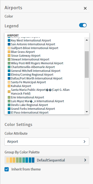
Select the color icon on the sidebar menu. The Color sidebar for the visual appears.
-
Configure the color settings as described below. As you change the color settings, the legend at the top of the Color sidebar shows how the legend will appear on the visual. Supported color specifications are described in Specify Colors.
Setting Description Legend Enable or disable to display a dynamic legend in this visual. Dynamic legends allow you to temporarily add or remove data shown in the visual. - For distinct color styles, select a data point in the legend to turn it off and on in the visual.
- Use the color selector to manually assign colors for legend items.
If available, enable or disable a static legend for this visual.Color Attribute Select the attribute that affects the segment color in the visual. Color Palette Select a color palette for this specific visual.
Select the Inherit from theme checkbox to use the color palette specified by the theme. - Close the Color sidebar and the color settings are dynamically applied to the visual.
- Select the save icon to save the dashboard and the visual with its updated settings.
Line Trend: Multiple Metric Charts
Multiple metric line charts are based on multiple metrics and one time attribute. Multiple metric line charts are supported by all Self-Service Analytics data connectors except Cloudera Search. They are supported in this environment for Apache Solr connectors for version 5.2 or later. This topic describes:- Configure Settings for a Specific Multiple Metric Line Chart
- Configure Colors for a Specific Multiple Metric Line Chart
Configure Settings for a Specific Multiple Metric Line Chart
Change the settings for a specific multiple metric line chart- Edit the multiple metric line chart you want to modify. See Edit Visuals.
- If you are editing the visual in a dashboard, select Settings from the visual drop-down menu. The sidebar menu for the visual appears. If you are editing the visual from the Visual Gallery, the sidebar appears to the right of the visual.
-
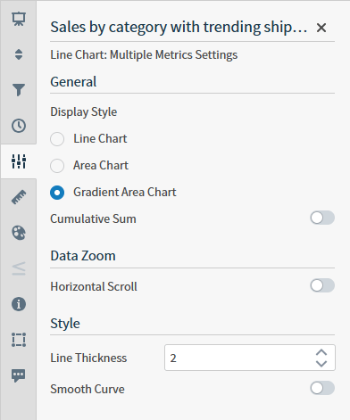
Select the settings icon on the sidebar menu. The Line Chart Settings sidebar for the visual appears.
-
Alter the settings as needed:
Setting Description Display Style Select Line Chart, Area Chart, or Gradient Area Chart to indicate the type of chart you want to see. Line Chart is selected by default. - Select Line Chart to display your data in a simple line format, using appropriate colors.
- Select Area Chart to display your data with a fill option for the line chart. This fills the visual with solid appropriate colors between the lines.
- Select Gradient Area Chart to display your data with a gradient fill option for the line chart. This fills the visual with a gradient of appropriate colors from opaque to transparent between the lines.
Cumulative Sum When enabled, Self-Service Analytics updates the visual to add the previous value to the next value, and both the original and cumulative value for selected items are displayed as a tool tip. Horizontal Scroll Select to enable users to scroll and zoom data for this visual. Other settings you define for this visual may limit the availability of this option. Line Thickness Increase or decrease the thickness of the lines in the visual using the up and down arrows in this box. Smooth Curve Disabled by default. - When disabled, lines render with straight line segments between data points.
- When enabled, all line series are rendered with fluid spline interpolation.
- Optionally, edit the number or date and time format for this visual. See Number and Date Formatting for Visuals and Configure Date and Time Formatting.
- Select the save icon to save the dashboard and the visual with its updated settings.
Configure Colors for a Specific Multiple Metric Line Chart
Specify the color settings for a specific multiple metric line chart using the Color sidebar- Edit the visual you want to modify. See Edit Visuals.
- If you are editing the visual in a dashboard, select Settings from the drop-down menu. The sidebar menu for the visual appears. If you are editing the visual from the Visual Gallery, the sidebar appears to the right of the visual. Select the color icon on the sidebar menu. The Color sidebar for the visual appears.
-
Configure the color settings as described below. As you change the color settings, the legend at the top of the Color sidebar shows how the legend will appear on the visual. Supported color specifications are described in Specify Colors.
Setting Description Legend Enable or disable to display a dynamic legend in this visual. Dynamic legends allow you to temporarily add or remove data shown in the visual.
For distinct color styles, select a data point in the legend to turn it off and on in the visual.Color Manually select the color for each metric using the color selector. <type> Color Palette Select a color palette for this specific visual.
Select the Inherit from theme checkbox to use the color palette specified by the theme. - Close the Color sidebar and the color settings are dynamically applied to the visual.
- Select the save icon to save the dashboard and the visual with its updated settings.
Edit Line & Bar Trend Charts
Line and bar trend charts are based on two metrics and a time attribute. They are supported by all Self-Service Analytics data connectors, except Cloudera Search, and by Self-Service Analytics Apache Solr connectors for version 5.2 or later.To edit the number or date and time format for this visual, see Number and Date Formatting for Visuals and Configure Date and Time Formatting.
Configure Colors for a Specific Line & Bar Trend Chart
Specify the color settings for a specific line & bar trend chart using the Color sidebar- Edit the visual you want to modify. See Edit Visuals.
-
If you are editing the visual in a dashboard, select Settings from the drop-down menu. The sidebar menu for the visual appears. If you are editing the visual from the Visual Gallery, the sidebar appears to the right of the visual.
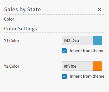
Select the color icon on the sidebar menu. The Color sidebar for the visual appears.
-
Configure the color settings as described below. As you change the color settings, the legend at the top of the Color sidebar shows how the legend will appear on the visual. Supported color specifications are described in Specify Colors.
- Close the Color sidebar and the color settings are dynamically applied to the visual.
- Select the save icon to save the dashboard and the visual with its updated settings.
Combo Charts
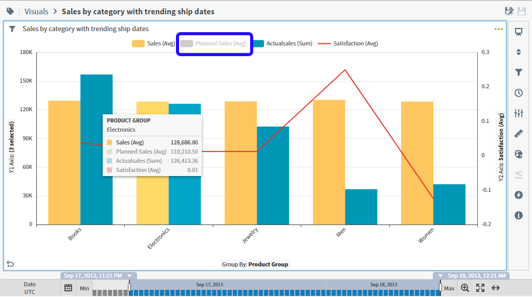
Combo charts are based on a single independent variable (usually the x-axis) and up to four dependent variables (usually the y-axes). The dependent variables can be plotted using either bar or line visual types. The independent variable (x-axis) can be any attribute or metric in the data; the dependent variables (y-axes) must be a metric (numeric field). A single attribute (independent variable) and two metrics (dependent variables) are required.To edit the number or date and time format for this visual, see Number and Date Formatting for Visuals and Configure Date and Time Formatting.
Planned Sales (Sum) metric is not shown on the chart and its name is grayed out in the legend. Adjust metric label visibility, values displayed, and positioning as needed.
Configure Settings for a Specific Combo Chart
Change the settings for a specific combo chart- Edit the combo chart you want to modify. See Edit Visuals.
- If you are editing the visual in a dashboard, select Settings from the drop-down menu. The sidebar menu for the visual appears. If you are editing the visual from the Visual Gallery, the sidebar appears to the right of the visual.
-
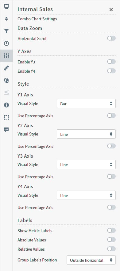
Select the settings icon on the sidebar menu. The Combo Chart Settings sidebar for the visual appears.
-
Alter settings as needed:
- Select the save icon to save the dashboard and the visual with its updated settings.
Configure Colors for a Specific Combo Chart
Specify the color settings for a specific combo chart using the Color sidebar- Edit the visual you want to modify. See Edit Visuals.
-
If you are editing the visual in a dashboard, select Settings from the visual drop-down menu. The sidebar menu for the visual appears. If you are editing the visual from the Visual Gallery, the sidebar appears to the right of the visual.
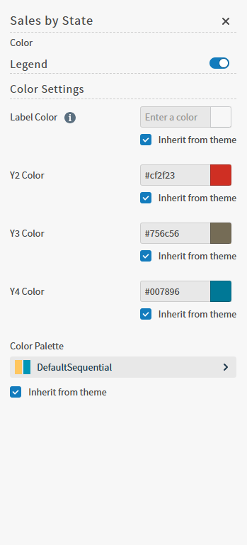
Select the color icon on the sidebar menu. The Color sidebar for the visual appears.
-
Configure the color settings as described below. As you change the color settings, the legend at the top of the Color sidebar shows how the legend will appear on the visual. Supported color specifications are described in Specify Colors.
Setting Description Legend Enable or disable to display a dynamic legend in this visual. Dynamic legends allow you to temporarily add or remove data shown in the visual. - For distinct color styles, select a data point in the legend to turn it off and on in the visual.
If available, enable or disable a static legend for this visual.Label Color The inherited label color from the theme. Select to clear the Inherit from theme checkbox to define a different color manually. Y2, Y3, Y4 Color Select colors for the Y2, Y3, and Y4 dependent variables plotted on the combo chart. Select to clear the Inherit from theme checkbox to define a different color manually. Color Palette Select the color palette for the Y1 axis for this specific combo chart. Select to clear the Inherit from theme checkbox to define a different color manually. - Close the Color sidebar and the color settings are dynamically applied to the visual.
- Select the save icon to save the dashboard and the visual with its updated settings.
Waterfall
Waterfall visuals are based on at least one time attribute and one or multiple metrics, and can incorporate positive and negative values. You can include a reference line, grid lines, and a Totals bar. Waterfall visuals with multiple metrics are supported by all Self-Service Analytics data connectors. For information on setting even time intervals, see Even Time Intervals.Configure Settings for a Waterfall Visual
Change the settings for a waterfall visual- Edit the waterfall visual you want to modify. See Edit Visuals.
- If you are editing the visual in a dashboard, select Settings from the drop-down menu. The sidebar menu for the visual appears. If you are editing the visual from the Visual Gallery, the sidebar appears to the right of the visual.
-
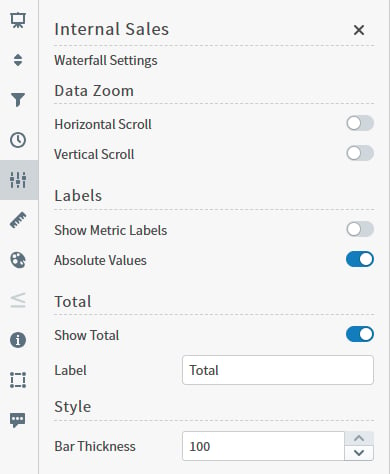
Select the settings icon on the sidebar menu. The Waterfall Settings sidebar for the visual appears.
-
Alter the settings as needed:
- Optionally, edit the number or date and time format for this visual. See Number and Date Formatting for Visuals and Configure Date and Time Formatting.
- Select the save icon to save the visual, or dashboard and the visual with updated settings.
Configure Colors for a Waterfall Visual
Specify the color settings for a Waterfall Visual using the Color sidebar- Edit the visual you want to modify. See Edit Visuals.
- If you are editing the visual in a dashboard, select Settings from the visual drop-down menu. The sidebar menu for the visual appears. If you are editing the visual from the Visual Gallery, the sidebar appears to the right of the visual. Select the color icon on the sidebar menu. The Color sidebar for the visual appears.
-
Configure the color settings as described below. As you change the color settings, the legend at the top of the Color sidebar shows how the legend will appear on the visual. Supported color specifications are described in Specify Colors.
Setting Description Legend Enable or disable to display a dynamic legend in this visual. Dynamic legends allow you to temporarily add or remove data shown in the visual. - For distinct color styles, select a data point in the legend to turn it off and on in the visual.
- For gradient color styles, use the legend’s gradient slider to show and hide your data.
- Use the color selector to manually assign colors for legend items.
If available, enable or disable a static legend for this visual.Color Manually select the colors for each metric using the color selector. Visuals that incorporate positive and negative values displays color options paired as <field> and <field> (Negative). Options include - Select individual colors to choose a custom color for any or all metrics. Custom colors are listed by metric in the Assigned Colors work area.
- Select Reset Colors in the Assigned Colors work area to revert your colors to their previous saved state.
Total Color Manually select a color for the Total using the color selector, or select the Inherit from theme checkbox to use the color palette specified by the theme. <type> Color Palette Select a color palette for this specific visual.
Select the Inherit from theme checkbox to use the color palette specified by the theme. - Close the Color sidebar and the color settings are dynamically applied to the visual.
- Select the save icon to save the dashboard and the visual with its updated settings.