
- Select the visual in the Visual Gallery or on a dashboard.
- If you selected the visual on a dashboard, select Settings on the visual drop-down menu to access the sidebar menu for the visual.
-
Select the sort and limit option (
 ) on the sidebar menu for the visual. The Sort & Limit sidebar opens.
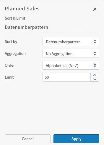
- Select a field to sort by from the drop-down menu in the Sort by box. If more than one sort field is used in your visual, more than one Sort by box appears on the sidebar.
-
For numeric Sort by fields:
- Indicate how the data should be aggregated for the visual by selecting an Aggregation option. These include: SUM, AVG, MIN, MAX, or LAST VALUE, Count, and Distinct Count. For explanations, see Metric Aggregation Functions.
- The option No Aggregation is available if you group and sort by the same field. When you use No Aggregation, you can select the sort Order of as Alphabetical (A-Z) or Reverse Alphabetical (Z-A).
-
For attribute Sort by fields:
- If you’re sorting by the same attribute field used in groups, you can select an Aggregation option of No Aggregation, Count, or Distinct Count.
- If you are sorting by a field not used in groups, you can select an Aggregation option of Count, or Distinct Count.
- Select a sorting option from the drop-down menu in the Order box (for example, Descending or Ascending). Different sorting options are available, depending on the Sort by field you select. If the selected Sort by field is a metric, you can sort the data in ascending or descending order. If the selected Sort by field is an attribute, you can sort the data in alphabetical or reverse-alphabetical order. For time attribute-based visuals, you can sort in chronological or reverse-chronological order.
- To limit the amount of data displayed in the visual, enter or specify a number in the Limit box. This number is the number of data points shown on the visual. (For example, for bar charts, this represents the number of bars.) Valid values range from 1 to 999999999. If this setting is set too large, browser performance may be affected and the visual may not be able to render the data effectively.
- Select Apply to apply your changes to the visual.
Sort & Limit Processing for Visuals With Two Attribute Group-By Fields
The logic used for sort and limit processing for visuals that use two attribute group-by fields (such as heat maps or floating bubble charts) requires additional explanation. The sort and limit logic used in Self-Service Analytics are linked to each other and are not global. Thus, the unique entries available for group 2 sort and limit processing depend on the number of unique entries produced by group 1 sort and limit processing.Limit Processing
In general, when two attribute group-by fields are used in a visual, the limit for group 1 affects the maximum number of elements available to be limited by group 2. So the limit for group 1 is applied first and the limit for group 2 is applied to the results of the limit for group 1. This limits the maximum number of subgroup elements within each group element.Heat Map Examples
In heat maps, you can apply a limit for both group 1 and group 2. The limit for group 2 depends on the results of the group 1 limit. The results from a group 1 limit should always match the limit set, but the results from a group 2 limit might match, but also might be less than the limit set. For example, if the limit for group 1 is 10, there should be 10 rows and columns in the result passed to the group 2 limit processing. So, if the limit for group 2 is also 10, fewer than 10 rows and columns may result from the group 2 limit processing. Here is another heat map example. Suppose your heat map has:- A group 1 limit of 10 and a group 2 limit of 5.
- From an absolute perspective, there are 100 unique group 1 values and 10 unique group 2 values.
Sort Processing
In general, when two attribute group-by fields are used in a visual, the sort for group 1 sorts all the data and the sort applied by group 2 sorts the subgroup (group 2 elements) within each group 1 element. To verify that sorting has happened correctly, compare the aggregate results of each group 1 element using whatever metric function or calculation logic applied, but compare the group 2 subgroup elements within the same group 1 element to make sure group 2 sorting is correct. Do not rely on the individual results shown on the tooltip when hovering over a data point — but look at the aggregate values for each group 1 element when verifying the sort logic. For example, assume you have a heat map where group 1 refers to rows and group 2 refers to columns. In one row (we will call it A) has one column with a really large value. however, if another row (B) has multiple columns that sum up to a larger value than the value in A), the B row will sort higher than the A row (assuming you are sorting in descending order by Sum). Here’s an extreme heat map example. Suppose row A has a single column point with a value of 1,000,000 and row B has 12 column points (subgroup elements) with values of 100,000 each. If you are sorting in descending order by this same metric on group 1, row B will sort higher than row A. Thus there might be a data point in the middle of the heat map that appears with a much higher individual metric value, but the chart is still sorted correctly.Floating Bubble Sort Processing
Floating bubble charts have two groups and two metrics. The first group-by attribute represents data along the X-axis and the second group-by attribute is reflected along the Y-axis. Self-Service Analytics determines the correct place on a chart for a data point based on the first metric (on the Y axis). The second metric affects the size of the bubbles only. Consequently, when you sort by the first group-by attribute (X-axis), it affects the representation of data long the X-axis and when you sort by the second group-by attribute (Y-axis), it affects the representation along the Y-axis.Sort and limit processing in scatter plot visuals sort and limit the data returned to the scatter plot and not the way the scatter plot is rendered on the screen.