
- Move, rearrange, and resize widgets. See Move, Swap, and Resize Visuals and Widgets in a Dashboard.
- Lock widgets in place by rows or columns to support your preferred layout. See Lock and Unlock Widget Positions.
- Serve your dashboard information on a variety of screen sizes, making use of responsive dashboard behavior to support mobile devices. See Use the Responsive Dashboard Layout.
Convert Dashboards
When you upgrade your environment, or import a dashboard from an earlier release, you must convert the dashboard to use the grid layout, widget locking, and responsive dashboard features. Converted dashboard widgets are presented in the responsive layout format in the same row and columnar layouts as in their previous configuration. Convert a dashboard layout:- Open an imported dashboard or an existing dashboard after upgrading. Self-Service Analytics prompts you to convert the dashboards to responsive format.
- Select the Convert Now option to convert the dashboard to responsive layout. Alternatively, select X to temporarily hide the conversion banner.
- Save the dashboard to save the converted dashboard. Alternatively, use the save as option to save the converted dashboard using a new name. The original dashboard remains unconverted and unchanged.
Once converted, you can move, swap, and resize widgets more easily, lock and unlock widgets, and enable or disable the responsive layout as needed.
api/dashboards/convert-layout/.
API documentation is provided in your environment at this link: https://<Self-Service Analytics-URL>/composer/swagger-ui.html.
Show or Hide the Conversion Option
Use the propertysuppressAutoLayoutWarning to control visibility of the conversion banner. By default, this is set to false, making the banner visible. In embedded environments, set to true to hide the banner.
If the banner is hidden, select the dashboard layout icon to make the banner and conversion option visible again.
Use the Responsive Dashboard Layout
Self-Service Analytics’s dashboard layout is responsive, building on a grid format that presents your dashboards to Users with Viewer access a flexible, mobile-friendly layout on a variety of screen sizes. Self-Service Analytics rebuilds the dashboard layout on smaller screen sizes for any widget wider than 250 pixels. Preview the dashboard in View mode. Edit mode: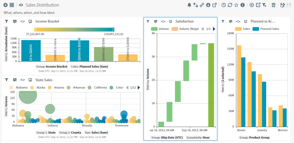
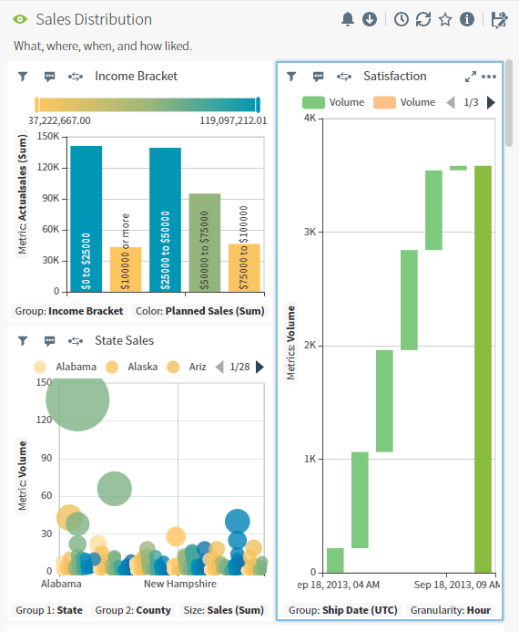
Manage Your Dashboard Layout
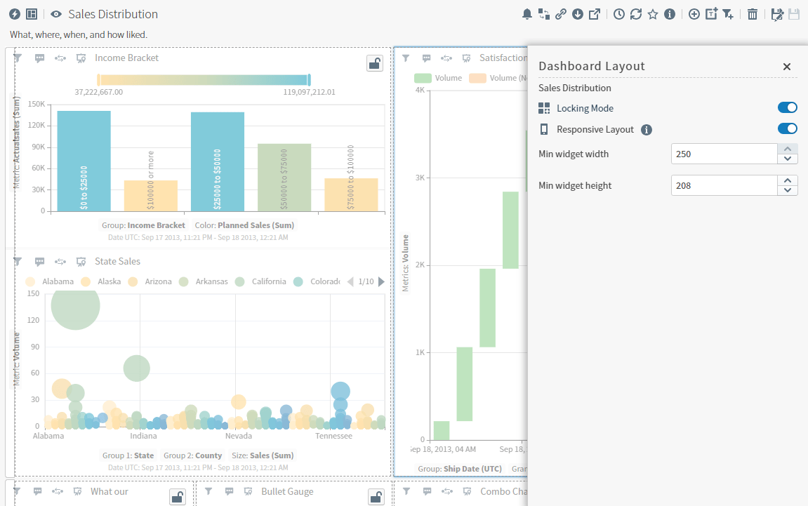
Select the Dashboard Layout icon ( ) to open the Dashboard Layout work area. Here you can enable and disable locking mode, the responsive layout, and manage the minimum widget widths and heights.
| Dashboard Layout Option | Description / Actions |
|---|---|
| Locking Mode |  Enable and disable the toggle to control widget locking in this dashboard. See Lock and Unlock Widget Positions. Enable and disable the toggle to control widget locking in this dashboard. See Lock and Unlock Widget Positions. |
| Responsive Layout |  Enable and disable the toggle to control responsive layout for this dashboard. Enable and disable the toggle to control responsive layout for this dashboard. |
| Min widget width | By default, the width is 250 pixels. Set from 1 to 250 pixels. When the dashboard is in View mode, widgets are resized to no smaller than the defined size, based on browser window size. |
| Min widget height | By default, the height is 50 pixels. Set from 1 to 250 pixels. When the dashboard is in View mode, widgets are resized to no smaller than the defined size, based on browser window size. |
Use the property
supressResponsiveLayout to control if the responsive layout is enabled or disabled. By default, this is set to false, enabling responsive layout. In embedded environments, set to true to suppress responsive layout.Lock and Unlock Widget Positions
The dashboard layout provides a flexible grid format, grouping widgets in rows and columns you can move, swap, or resize to meet your users’ needs. Additionally, you can lock some widgets in place by layout row or layout column to preserve their position and placement in your dashboard.You must convert older dashboard layouts to use this feature. See Convert Dashboards.
- Open a dashboard as an Owner or Editor.
-
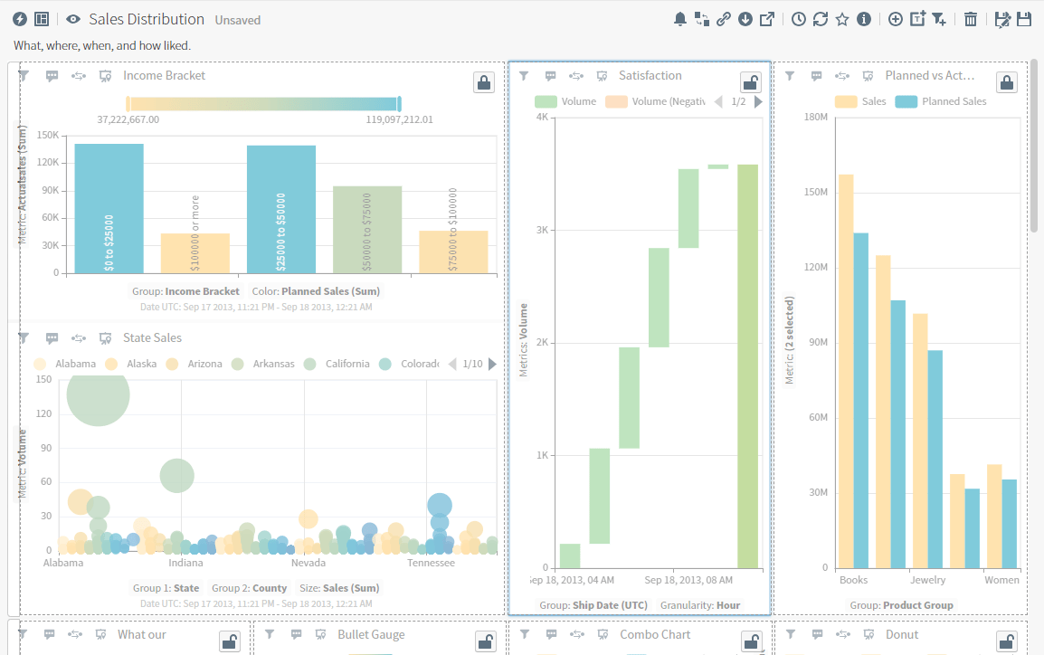
Select the Dashboard Layout icon. The Dashboard Layout work area opens. Select the toggle and enable Locking Mode.
The dashboard layout changes, displaying locked or unlocked icons on widgets and locked icons on locked rows.
-
To lock a widget, select
 to lock the column position and row height of the widget. The icon changes to
  to show it is locked.
To unlock a widget, select to unlock the column position and row height of the widget. The icon changes to show it is unlocked.
to show it is locked.
To unlock a widget, select to unlock the column position and row height of the widget. The icon changes to show it is unlocked.
-
To lock or unlock a row of widgets, select the far left border of a row to highlight the row. The dashboard layout changes, displaying an unlocked icon on the selected unlocked row.
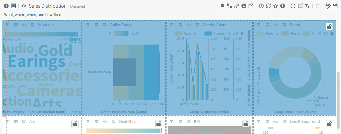
-
Select to lock the row’s height and position, or to unlock the row.
-
Select the Dashboard Layout icon and disable the Locking Mode toggle.
- Save your changes.
- Change the width of the locked layout column.
- Move the locked widgets.
- Change the height of a locked layout row or any layout row that includes locked widgets.
- Insert widgets next to or among some sides of locked widgets. Instead of a solid blue guidance line, Self-Service Analytics displays a gray dashed line.
Move, Swap, and Resize Visuals and Widgets in a Dashboard
Self-Service Analytics’s dashboard canvas is populated by information you add in widgets: visuals, rich text snippets, and filter snippets. Move and rearrange the sequence of these widgets, resize your widgets, or lock some in place by layout row or layout columns to present your information effectively on a variety of screen sizes. See Use the Responsive Dashboard Layout. The dashboard layout works in a grid format, grouping widgets in rows and columns when you add them in Edit mode. Self-Service Analytics automatically adds new widgets in rows, up to 4 widgets side by side in a single row. You can move, swap, or resize widgets to include more in a variety of arrangements.When you add a new widget, Self-Service Analytics automatically sizes it to fit in with existing widgets (if any) in a row. If your dashboard contains only one widget, you can not move or resize it; the widget takes up the entire dashboard area.
Widget Indicators
When you hover over or grab a widget to move, swap, or resize it, Self-Service Analytics may change your browser pointer to reflect an action you can take, such as resizing a widget, or can not take, such as resizing a locked widget. Additionally, indicators are shown in the dashboard itself, indicating where a widget will move to when you drop the widget.| Widget Indicator | Description / Actions |
|---|---|
 | Your browser pointer is hovering over a widget title pane or header, or hovering over a handle ( ) for minimally-sized widgets. ) for minimally-sized widgets.Select to grab and drag the widget to move or swap the widget. |
| A handle you can select to grab and drag the widget for moving or swapping. |
 | A resizing handle you can select to resize the contents of your widget vertically and horizontally within the responsive row and column. |
 | Your browser pointer is hovering over the top or bottom of a widget row. Select to drag to resize the row and the widgets in it taller or shorter. If you have stacked widgets in a column in the row, they are resized proportionally. |
 | Your browser pointer is hovering over the left or right side of a widget column. Select to drag and resize the column and the widgets in it wider or narrower. |
 | You can not move, swap, or resize the widget you are dragging here. |
 | Swap the widget you are dragging with the widget you are hovering over. The two widgets swap locations, each occupying the same footprint and position as each original widget. You can swap widgets not locked in place with widgets that are locked in a dashboard. See Lock and Unlock Widget Positions. |
 | Insert the widget you are dragging next to the widget, widget column, or widget row, as indicated by a solid blue guidance line at the insertion point. Drop your widget when the solid blue line is alongside the position you want.
If a widget position is row or column locked, the solid blue guidance line is a dashed gray line, indicating a widget can not be inserted in the position you want. See Lock and Unlock Widget Positions. |
Move Widgets
After you have added two or more widgets of any type to your dashboard, you can rearrange the widgets to position your visuals, rich text snippets, or filter snippets in a layout convenient to your users. To move a widget to a specific place on your dashboard, grab it by the title pane, header, or handle () while in edit mode, then drag and drop to the desired location.
Swap Widgets
After you have added two or more widgets of any type to your dashboard, swap widgets quickly and easily to reorder their position in the dashboard.- To swap unlocked widgets, grab one by the title pane, header, or handle while in edit mode, then drag and drop over the widget you want to swap it with.
- To swap an unlocked widget with a locked widget, grab the unlocked widget by the title pane, header, or handle while in edit mode, then drag and drop over the widget you want to swap it with.
- To swap locked widgets, unlock at least one widget, swap the widgets, then relock the widgets. See Lock and Unlock Widget Positions.
Resize Widgets
After you have added two or more widgets of any type to your dashboard, you can resize the widgets to display the information more clearly. For example, pair a wide visual chart with a narrow rich text snippet of information to give context to your data. Resize a widget- Select an unlocked widget in a dashboard you have open in Edit mode.
- Drag it by the handle () from an available side (top or bottom) to make it and the widgets in its row taller or shorter. Minimum height for a widget is 50 pixels.
- Drag it by the handle () from an available side (left or right) to make it and the widgets in the column narrower or wider.
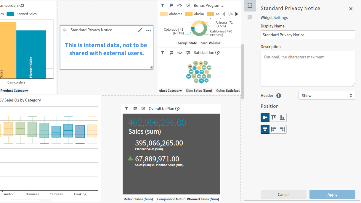
- Alternatively, drag it horizontally, vertically, or diagonally using the resize handle (). Adjust the Position options for the widget in the Widget Settings sidebar menu to frame it appropriately in the widget cell.
- Save your changes.
Position Resized Widgets
After you have used the resizing handle () to resize the contents of a widget, select a Position option to align it the way you want in the widget cell in the Widget Settings panel. When you select a position option, the icon colors invert to indicate the selection. Select Apply to align the widget using your new selections.
| Position Alignment | Description |
|---|---|
 | Select to align the widget centered, horizontally. |
 | Select to align the widget at the top of the available area, horizontally. |
 | Select to align the widget at the bottom of the available area, horizontally. |
 | Select to align the widget centered, vertically. |
 | Select to align the widget to the left of the available area, vertically. |
 | Select to align the widget at the right of the available area, vertically. |
Placement Indicators
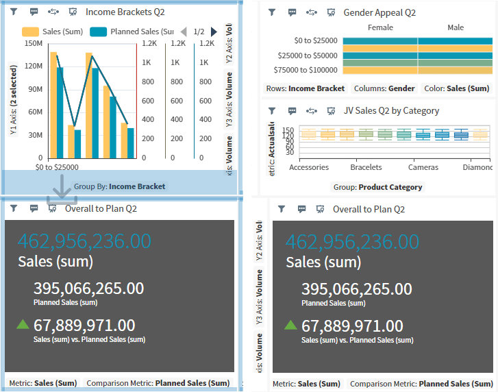
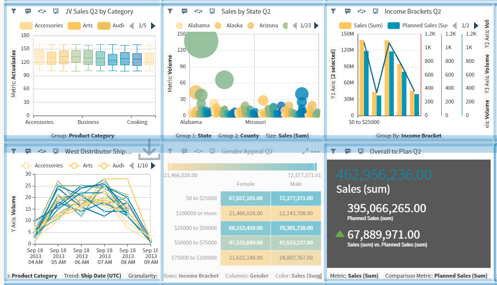
Placement indicators help you see where you can move a widget you have selected to drag and reposition. A wide bar appears along the edge of the target widgets when you attempt to reposition a widget above, below, or alongside a widget, or as a new row between widget rows.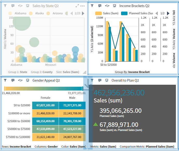
Use the Dashboard Icons
When you create or edit a dashboard, a series of icons are available you can use to perform specific dashboard functions.

The visibility of these icons on a dashboard are affected by dashboard interactivity settings. See Control How Users Interact With a Dashboard.
| Icon | Description |
|---|---|
 | Filter the data on a dashboard. Available only when all visuals on a dashboard are from the same data source. |
 | Open dashboard and visual interactivity settings. See Control How Users Interact With a Dashboard. |
| Select to open the Dashboard Layout work area. |
| Enable and disable the toggle to control widget locking in this dashboard. See Lock and Unlock Widget Positions. | |
| Enable and disable the toggle to control responsive layout for this dashboard. See Use the Responsive Dashboard Layout. | |
| Set the minimum widget width and height. See Use the Responsive Dashboard Layout. | |
 | Toggle dashboard view mode between Viewer and Editor modes. See Use Dashboard View Mode. |
 | Search visuals content in the dashboard, if supported by the source. |
 | Manage alerts. See Alerts |
 | Link fields between disparate data sources to create cross-source links. See Use Cross-Source Links. |
 | Link dashboard visuals to other dashboards. See Link a Dashboard. |
 | Export a dashboard. The Export drop-down menu appears. See Export Dashboards. |
 | Share a dashboard. The Share dashboard work area opens. See Share a Dashboard or Self Service Report with Users. |
 | Schedule dashboard reports. The Scheduled Reports work area opens. See Schedule a Self Service Report or Dashboard Report. |
 | Refresh the data on the dashboard. See Refresh Data on a Dashboard. |
 | Mark the dashboard as a favorite. |
 | Select to toggle the searchable information about this dashboard as visible in the dashboard header. When visible, you can select the description and edit it. |
 | Select to add a new local visual to the dashboard or add a Visual Gallery visual to the dashboard. See Manage Visuals and Add Existing Visuals to a Dashboard. |
 | Add a rich text snippet to the dashboard. See Add Rich Text Snippets to a Dashboard. |
 | Add a filter snippet to the dashboard. See Add Filter Snippets to a Dashboard. |
 | Delete the dashboard. See Delete a Dashboard. |
 | Save a dashboard with a new name (which copies it). See Copy a Dashboard. |
 | Save a dashboard. See Save a Dashboard. |
Use Dashboard View Mode
Dashboard view mode allows you, as a dashboard owner or editor, to see the same layout and options for dashboards you share with users. Toggle between View and Edit modes using the dashboard view mode icon ().
See Share a Dashboard or Self Service Report with Users.
View Mode
Users with Viewer access can see a shared dashboard and data in visuals at the same level of access you as have for that dashboard. You do not need to grant access to individual visuals and sources. Viewers can navigate and adjust the dashboard and visuals on a temporary basis. Any changes made are discarded when they navigate away from the dashboard. Toggle into View mode to generally see what your dashboard viewers see. Icons, options, or settings they can not access are disabled or hidden from view. If you are an editor or owner toggled into View mode, any changes you make are temporary as well. When you navigate away from the dashboard or switch back to Edit mode, the temporary changes are discarded. You can configure your embedded dashboards to hide widgets for unavailable visuals from Viewer users usinghideRestrictedVisuals. When enabled, available widgets adjust to fit the dashboard, replacing unavailable visuals. If no visuals are available, the dashboard displays a message that no visuals are available.
Your access and permission levels as a dashboard owner are different from your typical viewer users. The icons and options you see when working in View mode may be different from users with Viewer access.
Edit Mode
Users with Editor access can see a shared dashboard and data in visuals at the same level of access you have for that dashboard. You do not need to grant access individually to visuals and sources. Editors can adjust the dashboard and visuals, saving changes to the dashboard while in Edit mode. Dashboards are opened in Edit mode for dashboard owner and editor users. Toggle between Viewer and Edit modes to see generally what your dashboard viewers and editors see. Icons, options, or settings Viewers can not access are disabled or hidden from view..Your access and permission levels as a dashboard owner are different from your typical editor users. The icons and options you see when working in Edit mode may be different from users with Editor access.
Interactivity
When you create or edit a dashboard for your users, you can also control what options they see and changes they can make by defining appropriate interactivity settings. For both standalone and embedded environments:- You can define preferred interactivity settings
- Interactivity profile settings are applied
Embedded Environments
In embedded environments, dashboards open in Edit mode for all Owners and Editors. Toggle between Viewer and Edit modes to see generally what your dashboard viewers and editors see. Any icons, options, or settings they can not access are disabled or hidden from their view. You can also define a preferred embed configuration by- Defining the default mode for Editors
- Enabling or disabling access to interactivity settings for Editors
Controls Visibility
Controls visibility for dashboards are shown below. If Hidden, the visibility can not be overridden. If Default, visibility is controlled by the interactivity profile, interactivity overrides, or user permissions.
Controls visibility for widgets are shown below. If Hidden, the visibility can not be overridden. If Default, visibility is controlled by the interactivity profile, interactivity overrides, or user permissions.