
- Step 1. Add Axis Labels and Pickers
- Step 2. Add Tooltips
- Step 3. Add the Context Menu
- Step 4. Enable Cross-Visual Filtering
- Step 5. Add Other Controls
- Step 6. Create a Production Bundle
Step 1. Add Axis Labels and Pickers
It is very common for end users to want to explore a data set by changing the group-by and metric fields used by a chart. Self-Service Analytics provides an API for chart developers to quickly add axis labels that can act as controls to replace group-by and metric selections. Your current custom chart, created in this tutorial, has a default group-by and metric selection defined in the data source. Add axis labels so that you can change the group-by and metric selections within the chart itself-
In the terminal window, change directories to the local directory of “My First Custom Chart” and enter the following command to set the custom chart CLI in watch mode, if it is not in watch mode already.
-
In another terminal window, run the following command to compile a development version of the chart’s code using the webpack bundler:
For a refresher on this topic, see Step 4. Edit the Chart Code.
-
Edit the
src/index.jsfile in your preferred text editor or integrated development environment. -
Add the following code to the end of the
src/index.jsfile:Thecontroller.createAxisLabelmethod takes an object with the configuration options of the axis label. The following table describes possible option names and values you can use: - Preview the chart in a dashboard and notice the new axis labels/pickers below the chart. Play around with the controls and notice how the chart reacts to the changes in the query.
Step 2. Add Tooltips
In addition to axis labels, custom charts can define Self-Service Analytics tooltips so the custom chart’s look and feel is consistent with out-of-the-box charts. Define the tooltips using the API-
Add the original Self-Service Analytics data to the objects in the data set. We simply need to modify the
reshapeDatafunction in thesrc/index.jsfile as follows: -
Add
mousemoveandmouseoutevent handlers to the chart:Notice the use ofcontroller.tooltip.showandcontroller.tooltip.hide. Theshowmethod receives an option with the following properties:Optional Properties
When you mouse over a pie slice, themousemovehandler runs and thecontroller.tooltip.showAPI is called to display the tooltip. Likewise, themouseoutevent handler runs when the mouse leaves the pie slice and thecontroller.tooltip.hideAPI is called to hide the tooltip.
Step 3. Add the Context Menu
The context menu is a control found in many of the out-of-the-box charts. Visual developers select a chart’s data point to trigger the display of the context menu. Usually, the context menu is used to do quick filtering operations on the chart itself or other charts in the dashboard. An overview of the actions that can be selected on the context menu can be reviewed in Use the Context Menu. Self-Service Analytics provides an API that can be used to show the context menu with default actions. Add the context menu to your custom pie chart-
Add the following code in the
src/index.jsfile:Notice the use ofcontroller.menu.show. Theshowmethod receives an option with the following properties:Optional Properties
Now, whenever we click an option, the context menu displays and any of its actions can be triggered.
Step 4. Enable Cross-Visual Filtering
If you want your new chart to interact with other charts using cross-visual filtering, some controls must be enabled using the CLI.-
Enter the following command in the terminal window:
- Follow the prompts and select the Controls option.
-
Use the arrows and the spacebar to select:
- Publish to allow a chart with the context menu enabled to filter other charts on a dashboard.
- Subscribe to allow a chart to receive filters from other charts on the dashboard
- Press Enter to make your selections.
- Enter N to the prompt asking if you would like to make additional edits.
- Refresh the custom chart in a dashboard.
- Open the Dashboard Interactions dialog and select the Cross-Visual Filtering tab. See Understand the Cross-Visual Filtering Tab.
- Select your custom chart from the list on the left of the tab and configure the publish and subscribe settings for the custom chart. See Publish a Link and Subscribe a Visual to a Link.
- Select a pie slice in the custom pie chart to open the context menu. If you published the link for the field on which the pie chart is grouped, the Filter option appears in the context menu. Select this option to create a cross-visual filter using the link field for all the visuals on the dashboard that subscribe to the link.
Step 5. Add Other Controls
In addition to the controls described elsewhere in this tutorial, Self-Service Analytics allows chart developers to show or hide controls on the chart’s menu: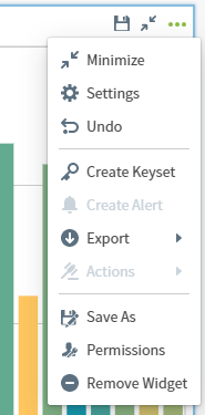
-
Enter the following command in the terminal window:
- Follow the prompts and select the Controls option.
- Use the arrows and the spacebar to select Color from the list.
- Press Enter to make your selections.
- Enter N to the prompt asking if you would like to make additional edits.
- Refresh the custom chart in a dashboard and notice the new color control on the chart’s drop-down menu. If you try to use the Color control, however, the panel does not open. The color control only works if you set one of the query variables as the driver color. Since this is a pie chart with a different color per slice, modify the group-by variable to use it as the driver of color in the chart.
-
Enter the following command in the terminal window:
- Follow the prompts and select the Variables option.
- Select Edit a variable.
- Select Group By | group |.
- Select Configuration.
- Select Attribute & Time.
- Enter Y to the prompt asking whether this variable will drive the color in your chart.
- Enter N to the prompt asking if you would like to make additional edits.
- Switch back to your dashboard and refresh the screen to get the latest changes to the chart. The color control should now work, but the colors displayed do not match the ones in the pie chart.
-
To fix the color mismatch, ECharts must be updated to identify the color to use for each of the pie slices. You can use a data accessor in the API. Edit the
src/index.jsfile and make the following minor modification:Notice how thegroupAccessoris used to extract the color since it is tied to the Group By variable that is driving the color of the chart. In the Self-Service Analytics dashboard, open the chart’s color palette and select the second color palette from the list.
Step 6. Create a Production Bundle
Throughout the tutorial, you have worked with the development version of the chart’s code. When you run thenpm start command, webpack compiles the chart’s assets into a single visualization.js file that is optimized for production usage. If you inspect the contents of the file, you will notice that the code is not minified and uglified. When the chart’s code is in a state that’s ready to be consumed by end-users, we recommend that you build a production version of the code that is optimized and has a reduced bundle size.
Create a production bundle
-
Run the following command in a terminal window. This instructs webpack to create an optimized bundle in the
visualization.jsfile. -
Run the following command to push the production bundle to the Self-Service Analytics server: