> ## Documentation Index
> Fetch the complete documentation index at: https://insightsoftware.mintlify.site/llms.txt
> Use this file to discover all available pages before exploring further.

# Part 3: Third-Party Charting Library Integration

> Part 3 of the custom chart tutorial shows you how to integrate third-party charting libraries to build dynamic custom charts.

This part of the custom chart tutorial explores integrating third-party charting libraries, such as D3, ECharts, and Highcharts, into your custom charts to build dynamic charts. It also covers how to create a chart container and how to use a library's API to render a standard chart. The following steps are performed in Part 3:

* [Step 1. About Third-Party Libraries](#step-1-about-third-party-libraries)
* [Step 2. Add Libraries](#step-2-add-libraries)
* [Step 3. Test Libraries](#step-3-test-libraries)
* [Step 4. Create a Chart Container](#step-4-create-a-chart-container)
* [Step 5. Render the Chart](#step-5-render-the-chart)
* [Step 6. Handle Resizing](#step-6-handle-resizing)

<h3 id="step-1-about-third-party-libraries">
  Step 1. About Third-Party Libraries
</h3>

Self-Service Analytics makes use of third-party libraries in the out-of-the-box charts provided with the product. Typically, these libraries fall into two categories:

* Charting libraries, which assist with the rendering of standard chart types like bar, line, pie, and scatter plot charts.
* Utility libraries, which assist with shaping data sets, formatting values, or providing useful JavaScript methods.

You can use third-party libraries to assist with the rendering and formatting requirements of a custom chart. This tutorial uses ECharts to assist with the rendering of your custom chart.

<h3 id="step-2-add-libraries">
  Step 2. Add Libraries
</h3>

**Begin using ECharts with your custom chart**

1. Add ECharts as a dependency of the custom chart. You can do this by installing ECharts using `npm`, which provides an easy-to-use software registry that can leveraged to install packages for your custom charts.

   ```bash theme={null}
   npm install echarts --save
   ```

2. Review the contents of the file `package.json` to ensure that Echarts is in the list of dependencies.

<h3 id="step-3-test-libraries">
  Step 3. Test Libraries
</h3>

**Test the libraries**

1. In the terminal window, change directories to the local directory of “My First Custom Chart” and enter the following command to set the custom chart CLI in watch mode, if it is not in watch mode already.

   ```
   cmp-chart watch
   ```

2. In another terminal window, run the following command to compile a development version of the chart’s code using the webpack bundler:

   ```bash theme={null}
   npm start
   ```

   For a refresher on this topic, see [Step 4. Edit the Chart Code](/simba-embedded-analytics/docs/self-service-analytics/26.3/embed-and-extend/custom-charts/custom-chart-tut-ov#step-4-edit-the-chart-code).

3. Edit the `src/index.js` file in your preferred text editor or integrated development environment.

4. Add a `console.log` line towards the top of the file, as shown:

   ```javascript theme={null}
   /* global controller */
   import echarts from 'echarts';
   import styles from './index.css';

   console.log(echarts ? 'The library is defined.' : 'The library is undefined');const groupAccessor = controller.dataAccessors['Group By'];const metricAccessor = controller.dataAccessors.Size;//...
   ```

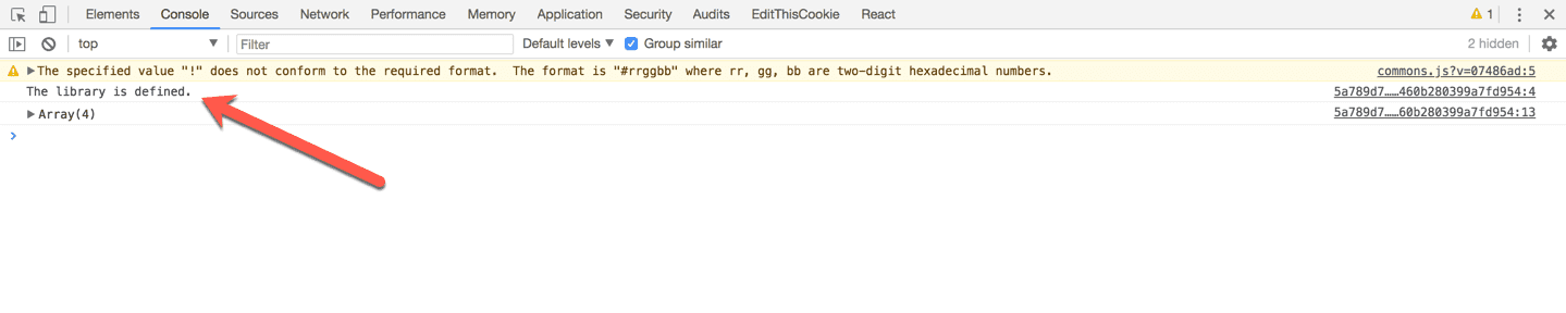
5. Check the contents of the browser console after adding the updated chart to a dashboard. The following image shows what the console should look like:

   <img src="https://mintcdn.com/insightsoftware/2cXq_sDOxrDVXUcv/simba-embedded-analytics/docs/self-service-analytics/26.3/images/customchart/library-defined.png?fit=max&auto=format&n=2cXq_sDOxrDVXUcv&q=85&s=cf3fae3304c13831e33aeaeb05fdbc7f" alt="" width="1439" height="288" data-path="simba-embedded-analytics/docs/self-service-analytics/26.3/images/customchart/library-defined.png" />

6. Once you confirm that the global variable is defined, you can remove the `console.log` statement.

<h3 id="step-4-create-a-chart-container">
  Step 4. Create a Chart Container
</h3>

As part of its charting API, Self-Service Analytics provides a `<div>` element that can hold the rendered contents of your custom chart. While it is perfectly fine to use that element as the chart container, we recommend that you create a separate container inside of that element to gain full control over its styles.

**Create a chart container**

1. Add the following `create chart containerconst` lines of code to the top of the `src/index.js` file:

   ```javascript theme={null}
   /* global controller */

   import echarts from 'echarts';

   import styles from './index.css';

   // create chart container
   const chartContainer = document.createElement('div');
   chartContainer.style.width = '100%';
   chartContainer.style.height = '100%';
   chartContainer.classList.add(styles.chartContainer);
   controller.element.appendChild(chartContainer);

   const groupAccessor = controller.dataAccessors['Group By'];
   const metricAccessor = controller.dataAccessors.Size;
   //...
   ```

   Notice the line: `controller.element.appendChild(chartContainer);`. `controller.element` is the `<div>` Self-Service Analytics provides with its API.

2. ```
   Modify the background color of the newly added container. Open the src/index.css component file, clear its contents, and add the following lines to the top of the file:
   .chartContainer {
     background-color: #323232;
   }
   ```

3. Refresh the dashboard with the custom chart, and you should see a dark gray background for your custom chart.

4. Change the background color to background-color: `#ffffff;` to set it back to white.
<h3 id="step-5-render-the-chart">
  Step 5. Render the Chart
</h3>

In [Part 2: Query Variables, Chart Defaults, Data Preview, and Data Accessors](/simba-embedded-analytics/docs/self-service-analytics/26.3/embed-and-extend/custom-charts/custom-chart-tut-ov-pt2), we defined a group-by variable and a metric variable to generate a grouped data set with a single metric value. This data structure works well with bar and pie charts. This step uses the ECharts API and its chart configuration option to create a pie chart with our data set.

1. In the `src/index.js` file, create a variable to hold an instance of the pie chart and a second variable to hold the chart configuration option. The chart’s instance is created using the `echarts.init` method and passing in a chart container. Add it right below the data accessors you created in Part 2:

   ```javascript theme={null}
   //...
   const groupAccessor = controller.dataAccessors['Group By'];
   const metricAccessor = controller.dataAccessors.Size;

   const chart = echarts.init(chartContainer);
   const option = {
     series: [
       {
         name: metricAccessor.getLabel(),
         type: 'pie',
       },
     ],
   };
   //...
   ```

   Notice how we used the metric accessor to dynamically capture the name of the series.

2. Specify the **pie** series data and call the chart’s `setOption` method inside of the `controller.update` function:

   ```javascript theme={null}
   //...
   controller.update = data => {
     // Called when new data arrives
     option.series[0].data = reshapeData(data);
     chart.setOption(option);
   };
   //...
   ```

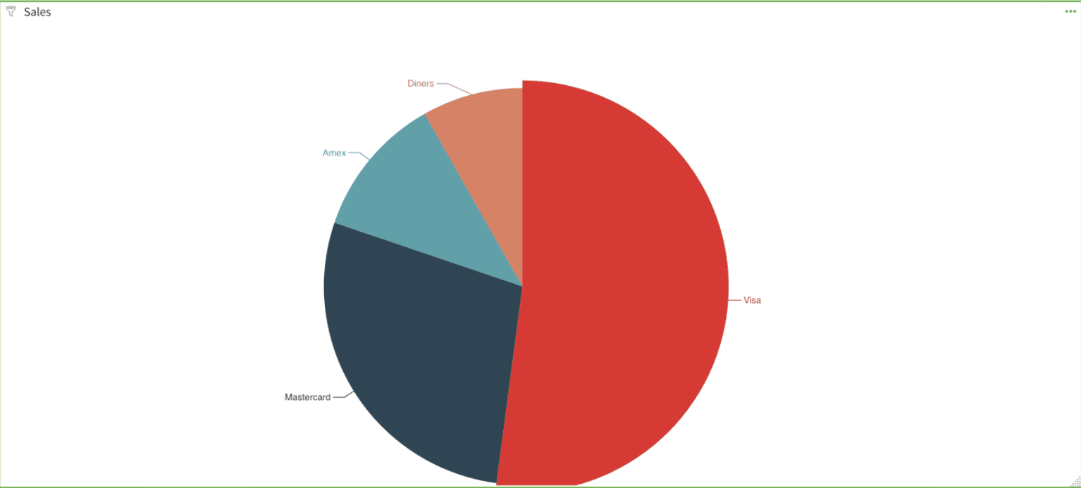
   A pie chart renders similar to this:

   <img src="https://mintcdn.com/insightsoftware/2cXq_sDOxrDVXUcv/simba-embedded-analytics/docs/self-service-analytics/26.3/images/customchart/piecht1.png?fit=max&auto=format&n=2cXq_sDOxrDVXUcv&q=85&s=d0b9cab4d56b069a7f08718a32a85d37" alt="" width="1534" height="693" data-path="simba-embedded-analytics/docs/self-service-analytics/26.3/images/customchart/piecht1.png" />

   Unfortunately, the pie chart is slightly cut off at the bottom, so the window needs to be resized. Read on.

<h3 id="step-6-handle-resizing">
  Step 6. Handle Resizing
</h3>

Self-Service Analytics provides an API to notify the charts of a resize operation.

**Resize the window**

* Add the `controller.resize` function at the end of the `src/index.js` file.

  ```javascript theme={null}
  //...
  controller.resize = (newWidth, newHeight) => {
    // Called when the widget is resized
    chart.resize();
  };
  ```

  The `resize` method of the EChart’s chart instance tells the chart to fit the new dimensions of the chart container.

Play around and add some filters or change the chart’s default configuration. You should see the data re-render as you modify the query with the filter or time bar control.

Looking Good! You now have a chart you can reuse with any data source. Continue to [Part 4: Custom Chart Controls](/simba-embedded-analytics/docs/self-service-analytics/26.3/embed-and-extend/custom-charts/custom-chart-tut-ov-pt4).
