> ## Documentation Index
> Fetch the complete documentation index at: https://insightsoftware.mintlify.site/llms.txt
> Use this file to discover all available pages before exploring further.
# Rulers and Reference Lines
> Rulers can be used to customize the markers used on the metric axis. You can change the (metric) axis range in a visual along with the markers along the axis. Customizing this range may help you focus your data exploration to specific data points. You can set minimum and maximum values for your axis, define the steps, enable the gridlines, and use a logarithmic scale.
## Use Rulers
Rulers can be used to customize the markers used on the metric axis. You can change the (metric) axis range in a visual along with the markers along the axis. Customizing this range may help you focus your data exploration to specific data points. You can set minimum and maximum values for your axis, define the steps, enable the gridlines, and use a logarithmic scale.
Rulers functionality is available only for bar charts, line charts, and waterfall visuals. Controls for rulers are provided using the interactivity sidebar. See [Control How Users Interact With a Visual](/simba-embedded-analytics/docs/self-service-analytics/26.3/analyze-data/visuals/visual-interactivity).
Rulers can be customized for a visual using the Rulers sidebar.
See the following topics:
* [The Rulers Sidebar](#the-rulers-sidebar)
* [Enable and Disable Ruler Grid Lines](#enable-and-disable-ruler-grid-lines)
* [Configure the Ruler Y-Axis Range Settings](#configure-the-ruler-y-axis-range-settings)
* [Use the Ruler Log Scale Function](#use-the-ruler-log-scale-function)
Arc gauges use the Rulers sidebar to control some different settings than are used by most visuals. See [Single Metric Visuals](/simba-embedded-analytics/docs/self-service-analytics/26.3/analyze-data/visuals/arc).
The Rulers sidebar for a visual allows you to customize the rulers and reference lines used by the visual. When you save or export your visual, the settings configured on the Rulers sidebar are saved or exported respectively.
**Access the Rulers sidebar**
1. Select the visual in the [Visual Gallery](/simba-embedded-analytics/docs/self-service-analytics/26.3/analyze-data/visuals/visual-gallery) or on a dashboard.
2. Select **Settings** on the [visual drop-down menu](/simba-embedded-analytics/docs/self-service-analytics/26.3/analyze-data/visuals/visual-setup#use-the-visual-drop-down-menu) to access the [sidebar menu](/simba-embedded-analytics/docs/self-service-analytics/26.3/analyze-data/visuals/visual-setup#use-the-visual-sidebar-menu) for the visual. Then select  on the [sidebar menu](/simba-embedded-analytics/docs/self-service-analytics/26.3/analyze-data/visuals/visual-setup#use-the-visual-sidebar-menu). The Rulers sidebar opens.
The sidebar consists of two sections: the (metric) ruler settings and, possibly, reference lines. If the visual does not support reference lines, this section is not available. See [Enable and Disable Ruler Grid Lines](#enable-and-disable-ruler-grid-lines) and [Use Reference Lines](#use-reference-lines).
Arc gauges use the Rulers sidebar to control some different settings than are used by most visuals. See [Single Metric Visuals](/simba-embedded-analytics/docs/self-service-analytics/26.3/analyze-data/visuals/arc).
on the [sidebar menu](/simba-embedded-analytics/docs/self-service-analytics/26.3/analyze-data/visuals/visual-setup#use-the-visual-sidebar-menu). The Rulers sidebar opens.
The sidebar consists of two sections: the (metric) ruler settings and, possibly, reference lines. If the visual does not support reference lines, this section is not available. See [Enable and Disable Ruler Grid Lines](#enable-and-disable-ruler-grid-lines) and [Use Reference Lines](#use-reference-lines).
Arc gauges use the Rulers sidebar to control some different settings than are used by most visuals. See [Single Metric Visuals](/simba-embedded-analytics/docs/self-service-analytics/26.3/analyze-data/visuals/arc).
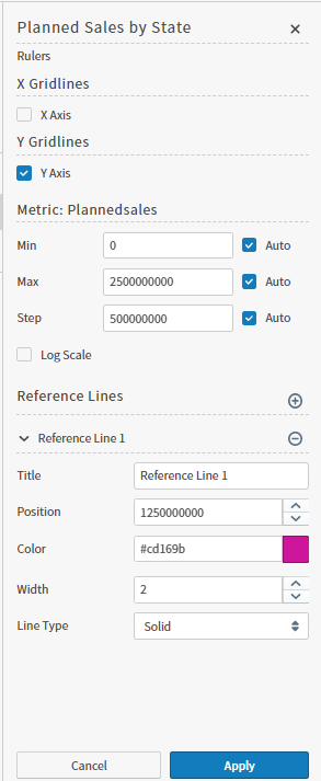 3. Select **Apply** to apply any changes you make.
Enable and Disable Ruler Grid Lines
Grid lines provide a visual cue between data elements and metric ranges in a visual. They are displayed as light gray lines on the visual canvas horizontally and vertically. When enabled, they extend from the tick marks on the axes.
Grid lines may help you to analyze and compare the data elements in your visual.
Arc gauges use the Rulers sidebar to control some different settings than are used by most visuals. See [Single Metric Visuals](/simba-embedded-analytics/docs/self-service-analytics/26.3/analyze-data/visuals/arc).
**Enable grid lines**:
1. Access the Rulers sidebar for the visual. See [The Rulers Sidebar](#the-rulers-sidebar).
2. In the **X Gridlines** section of the sidebar, select (check) the **X Axis** checkbox to enable vertical rulers on the visual.
3. In the **Y Gridlines** section of the sidebar, select (check)the **Y Axis** checkbox to enable horizontal rulers on the visual. By default, the **Y Axis** checkbox is selected.
On a [combo chart](/simba-embedded-analytics/docs/self-service-analytics/26.3/analyze-data/visuals/bar-standard#combo-charts), four y-axis checkboxes are available: **Y1 Axis**, **Y2 Axis**, **Y3 Axis**, and **Y4 Axis**. By default only the **Y1 Axis** checkbox is selected.
4. You can specify the minimum (**Min**) and maximum (**Max**) values of the metrics that are plotted. Also specify the value used between grid lines (the **Step**) shown on the chart. In all cases, you can select the **Auto** checkbox to have Self-Service Analytics automatically select the minimum, maximum, and step values automatically, based on the data.
On a [combo chart](/simba-embedded-analytics/docs/self-service-analytics/26.3/analyze-data/visuals/bar-standard#combo-charts), you can specify minimum, maximum, and step values for all four y-axes.
5. Select the **Log Scale** checkbox for any metric to change the axis based on orders of magnitude of the metric selected for that axis. See [Use the Ruler Log Scale Function](#use-the-ruler-log-scale-function).
6. Select **Apply** to apply the ruler settings to the visual.
**Disable grid lines**
1. Access the Rulers sidebar for the visual. See [The Rulers Sidebar](#the-rulers-sidebar).
2. In the **Rulers** section of the sidebar, clear the **X Axis** checkbox to disable vertical rulers on the visual. Clear the **Y Axis** checkbox to disable horizontal rulers on the visual.
On a [combo chart](/simba-embedded-analytics/docs/self-service-analytics/26.3/analyze-data/visuals/bar-standard#combo-charts), four axis checkboxes are available: **Y1 Axis**, **Y2 Axis**, **Y3 Axis**, and **Y4 Axis**. Clear the appropriate checkboxes to disable horizontal rulers for the appropriate combo chart dependent variables.
3. Select **Apply** to apply the ruler settings to the visual.
Use the Ruler Log Scale Function
The log scale function changes the axis based on orders of magnitude of the metric selected for that axis. A log scale is nonlinear and best used when there is a large range in quantity. Log scales can only be used for positive values. In addition, when this option is selected, the **Auto** option is enabled for **Min**, **Max**, and **Step**.
The scale is built for whole the data range.
To enable the log scale function for the visual, select the **Log Scale** checkbox to enable. To disable, clear the checkbox.
If your dataset includes zero values or negative values, the log scale function will not work as expected.
The Log Scale function is not available for arc gauges. Arc gauges use the Rulers sidebar to control some different settings than are used by most visuals. See [Single Metric Visuals](/simba-embedded-analytics/docs/self-service-analytics/26.3/analyze-data/visuals/arc).
The y-axis range settings on the Ruler sidebar control the minimum and maximum values for the metric shown in the visual. You can configure the default values for Min, Max, and Step. When the Rulers sidebar is initially opened, these settings are set to **Auto**.
To customize the range, clear the **Auto** checkbox next to the **Min** and **Max** boxes and then enter your custom value ranges in the boxes. Customizing the axis in this way can create a view into your data that drills into specific information, explores anomalies, and otherwise explores more relevant information.
You can further this exploration by clearing the **Auto** checkbox next to **Step**, and specifying the interval for the tick marks along the y-axis. Steps can be specified down to the tenth place, or one decimal point. For example, you can step the tick marks by .5 tenths. If you specify a step that cannot be displayed on the axis, the default minimal step value is applied.
Use Reference Lines
Reference lines on a visual can be used to mark limits, thresholds, and critical values. They can mark both positive and negative values on an axis. Multiple reference lines can be added in a visual.
Reference lines are available only for bar and line charts. Controls are provided using the Rulers interactivity sidebar. See [Control How Users Interact With a Visual](/simba-embedded-analytics/docs/self-service-analytics/26.3/analyze-data/visuals/visual-interactivity).
Reference lines can be customized for a visual using the Rulers sidebar.
See the following topics:
* [The Rulers Sidebar](#the-rulers-sidebar)
* [Create a Reference Line](#create-a-reference-line)
* [Modify a Reference Line](#modify-a-reference-line)
* [Delete a Reference Line](#delete-a-reference-line)
Create a Reference Line
You can add multiple reference lines to a visual.
**Create a reference line on a visual**
1. Access the Rulers sidebar for the visual. See [The Rulers Sidebar](#the-rulers-sidebar).
2. In the **Reference Lines** section of the sidebar, select the add icon  to start a new reference line definition.
3. Fill in the following fields for the reference line as needed:
* **Title** - Specify the name for the line. The default name of the line is Reference line #.
* **Position** - By default, the reference line is added to the middle of the visible axis. You can specify a different position on the axis by either entering a specific number value. The reference line changes its position depending on your input.
* **Color** - Select the desired color for the line.
* **Width** - Specify the line’s thickness: enter a specific value or use the slider.
* **Line type** - Select from the following types: Solid, Dashed, or Dotted.
4. Select **Apply** to apply the reference line to the visual.
to start a new reference line definition.
3. Fill in the following fields for the reference line as needed:
* **Title** - Specify the name for the line. The default name of the line is Reference line #.
* **Position** - By default, the reference line is added to the middle of the visible axis. You can specify a different position on the axis by either entering a specific number value. The reference line changes its position depending on your input.
* **Color** - Select the desired color for the line.
* **Width** - Specify the line’s thickness: enter a specific value or use the slider.
* **Line type** - Select from the following types: Solid, Dashed, or Dotted.
4. Select **Apply** to apply the reference line to the visual.
Modify a Reference Line
You can modify a visual's reference lines using the Rulers sidebar.
**Modify a reference line on a visual**
1. Access the Rulers sidebar for the visual. See [The Rulers Sidebar](#the-rulers-sidebar).
2. In the **Reference Lines** section of the sidebar, locate the reference line you want to modify.
3. Modify the fields for the reference line as needed:
* **Title** - Specify the name for the line. The default name of the line is Reference line #.
* **Position** - By default, the reference line is added to the middle of the visible axis. You can specify a different position on the axis by either entering a specific number value. The reference line changes its position depending on your input.
* **Color** - Select the desired color for the line.
* **Width** - Specify the line’s thickness: enter a specific value or use the slider.
* **Line type** - Select from the following types: Solid, Dashed, or Dotted.
4. Select **Apply** to apply the reference line changes to the visual.
Delete a Reference Line
**Delete a reference line on a visual**
1. Access the Rulers sidebar for the visual. See [The Rulers Sidebar](#the-rulers-sidebar).
2. In the **Reference Lines** section of the sidebar, locate the reference line you want to delete.
3. Select  to the right of the reference line definition on the Rulers sidebar.
4. Select **Apply** to delete the reference line on the visual.
to the right of the reference line definition on the Rulers sidebar.
4. Select **Apply** to delete the reference line on the visual.